
air
lite
Breathe Better. Live Smarter.
Real-time air quality insights that put your health in your hands
🫁 100M+ Americans live with unhealthy air daily — we can help!
Real-Time monitoring
Seamless integration
Health insights
Summary
Problem
The air we breathe is harming us — and we might not even know it.
137 million+ Americans live with unhealthy air.
Many can’t track what they’re breathing or how it affects them.
Without real-time data or personal insights, daily health decisions are a guessing game.
Key Objectives
Empower users to proactively monitor and respond to air quality risks
Personalize insights to individual health, lifestyle, and location needs
Increase awareness and understanding of air quality trends over time
Improve public health outcomes by reducing exposure to harmful air pollutants
Design Process
Double Diamond Framework
I used the Double Diamond framework to deeply understand user needs, define clear goals, explore solutions, and deliver a refined product with real impact.
Discover
Define
Develop
Deliver
Discover
Research Goals
Understand user behaviors and pain points
Evaluate the impact of real-time air quality insights
Assess user adoption and trust in AI-powered predictions
Competitive Analysis
Strengths
Real-time air quality and pollutant data for informed decisions
Health and symptom tracking with reminders and emergency plans.
Smart home and environmental monitoring integration.
Opportunities
Simplify design to make air quality and health data easy for everyone.
Add fully customizable alerts and recommendations.
Position as an air health companion, beyond specific conditions.
Weaknesses
Overly technical medical language that alienates general users.
Confusing interfaces that overwhelm first-time users.
Limited personalization and difficulty tailoring to individual needs.
Threats
Strong competition from existing air quality apps.
Changing regulations on personal data and privacy.
Risk of overreliance without broader understanding or independent action.
SWOT
User Interviews
What Users Said:
They want to be notified about air quality
“I don’t always remember to check air quality, but if I got a notification telling me the air was bad today, I’d definitely pay attention.”
Participant from Minnesota
They want air quality information that is easy to understand
“I don’t have time to research what air quality levels mean. Just tell me if it’s safe to take my kids to the park.”
Participant from Florida
Key Findings
Users struggle to access and interpret real-time air quality data to take meaningful action.
People with asthma, allergies, and respiratory issues need a more accessible, user-friendly solution.
Clear, personalized warnings and recommendations are vital for managing air quality risks.
Simplicity and ease of use drive adoption and daily engagement.
Define
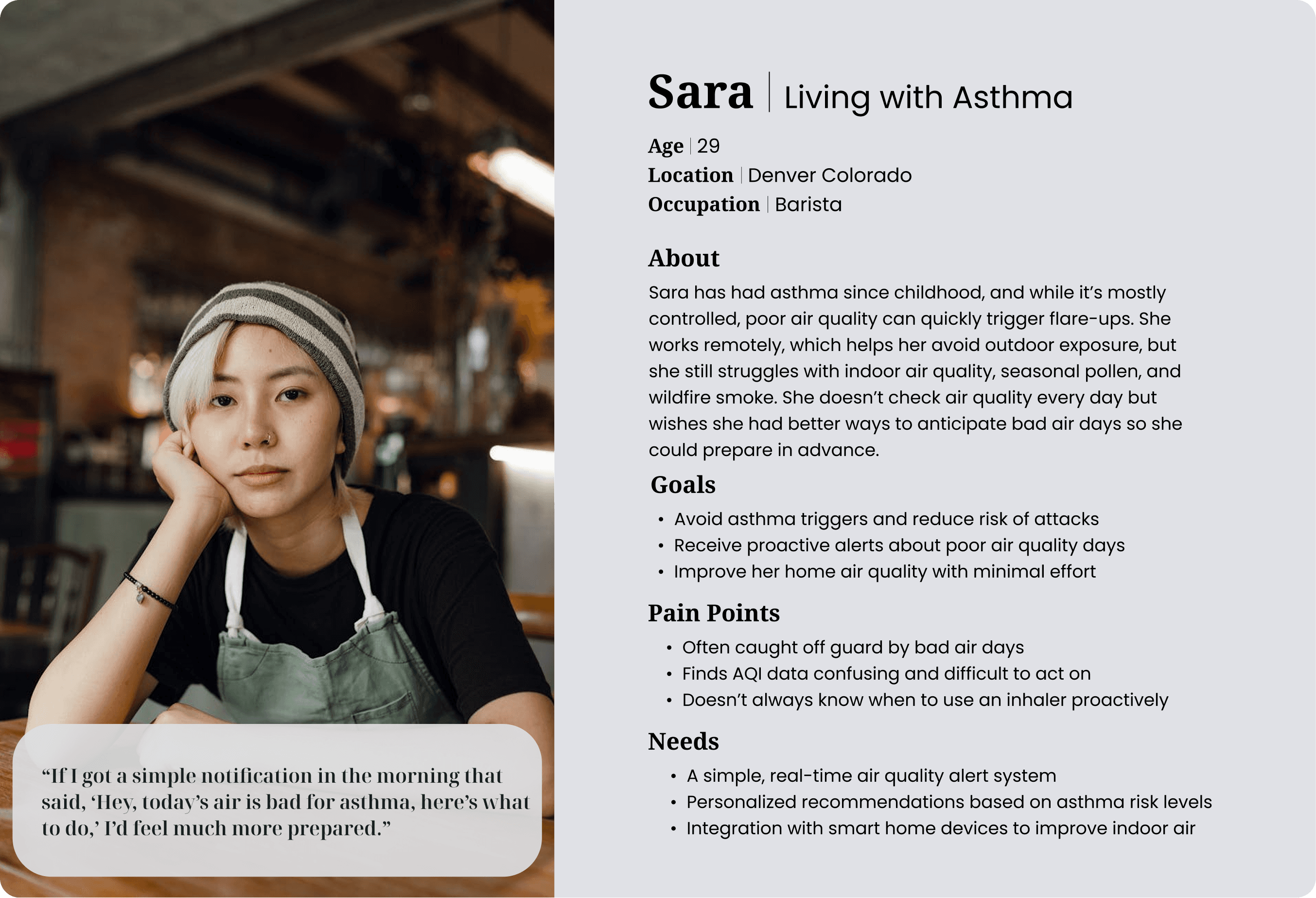
Persona
Design Opportunities by User Type
Individuals living with asthma:
How might we help them monitor air quality and symptoms to reduce exposure and manage flare-ups more effectively?
Air quality-conscious users:
How might we provide real-time and forecasted data to help them minimize exposure and protect their health?
Outdoor workers:
How might we deliver timely alerts so they can act quickly during poor air quality conditions?
Caregivers:
How might we enable them to track air quality and symptoms to proactively manage asthma risks for loved ones?
Aligning Business Goals and User Needs
Empower families with asthma to monitor air quality and respond with confidence.
Use “How Might We” framing to link health anxiety with clarity, alerts, and ease of use.
Prioritize family-friendly features and personalized insights.
Translate complex air quality data into simple, actionable tools for daily decisions.
Develop
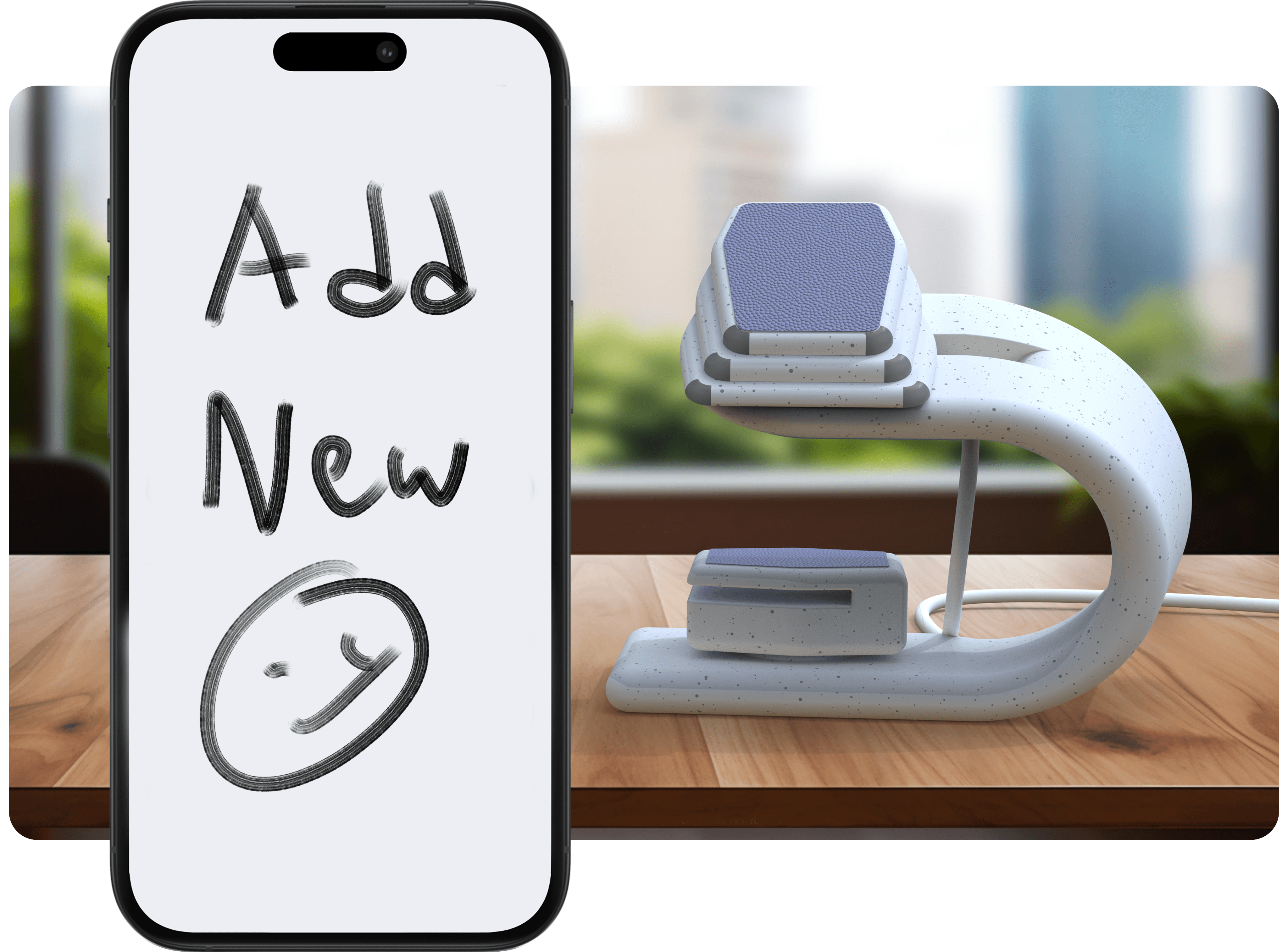
Information Architecture
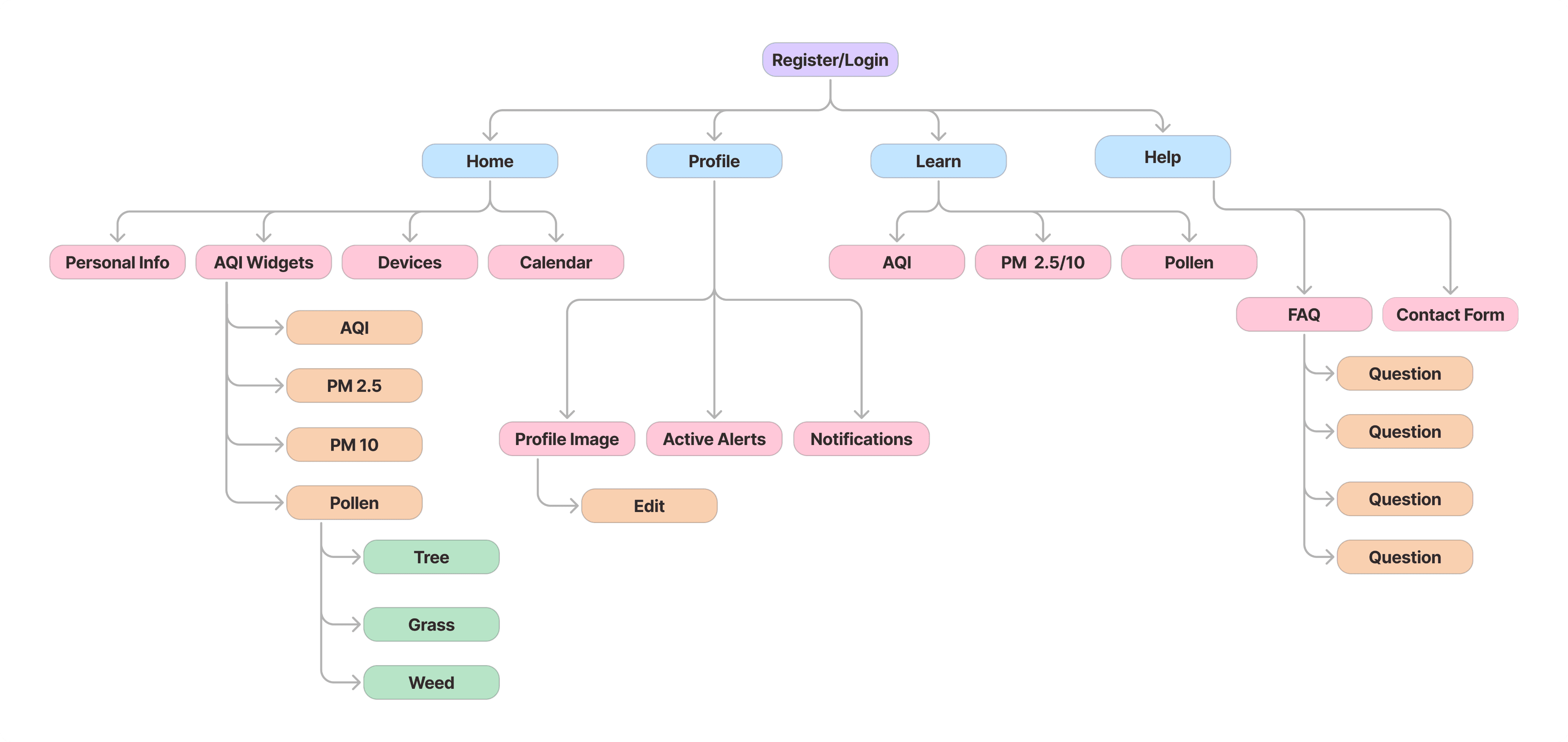
Component Description
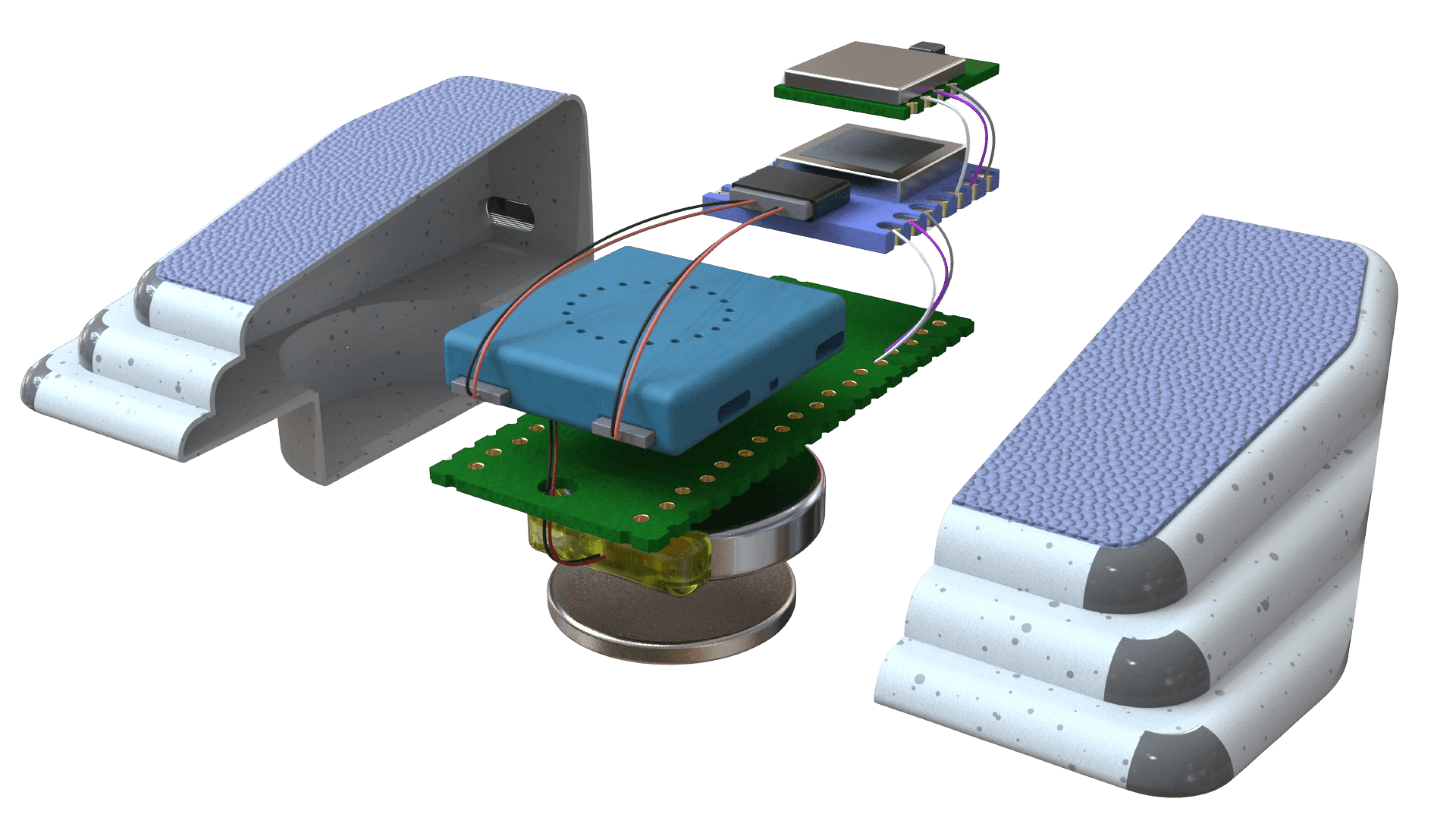
3
1
4
2
Design Refinements
1
Bluetooth Transmitter
1
Sends air quality data to phone.
2
Gas Sensor
1
Detects harmful gases like CO and VOCs.
3
Microcontroller
1
Processes data and controls the device.
4
PM/VOC Sensor
1
Measures fine particles and chemicals.
*Pollen Data
API data imported via Breezometer
4
4
Increased button contrast to improve visibility and emphasis.
Wireframes
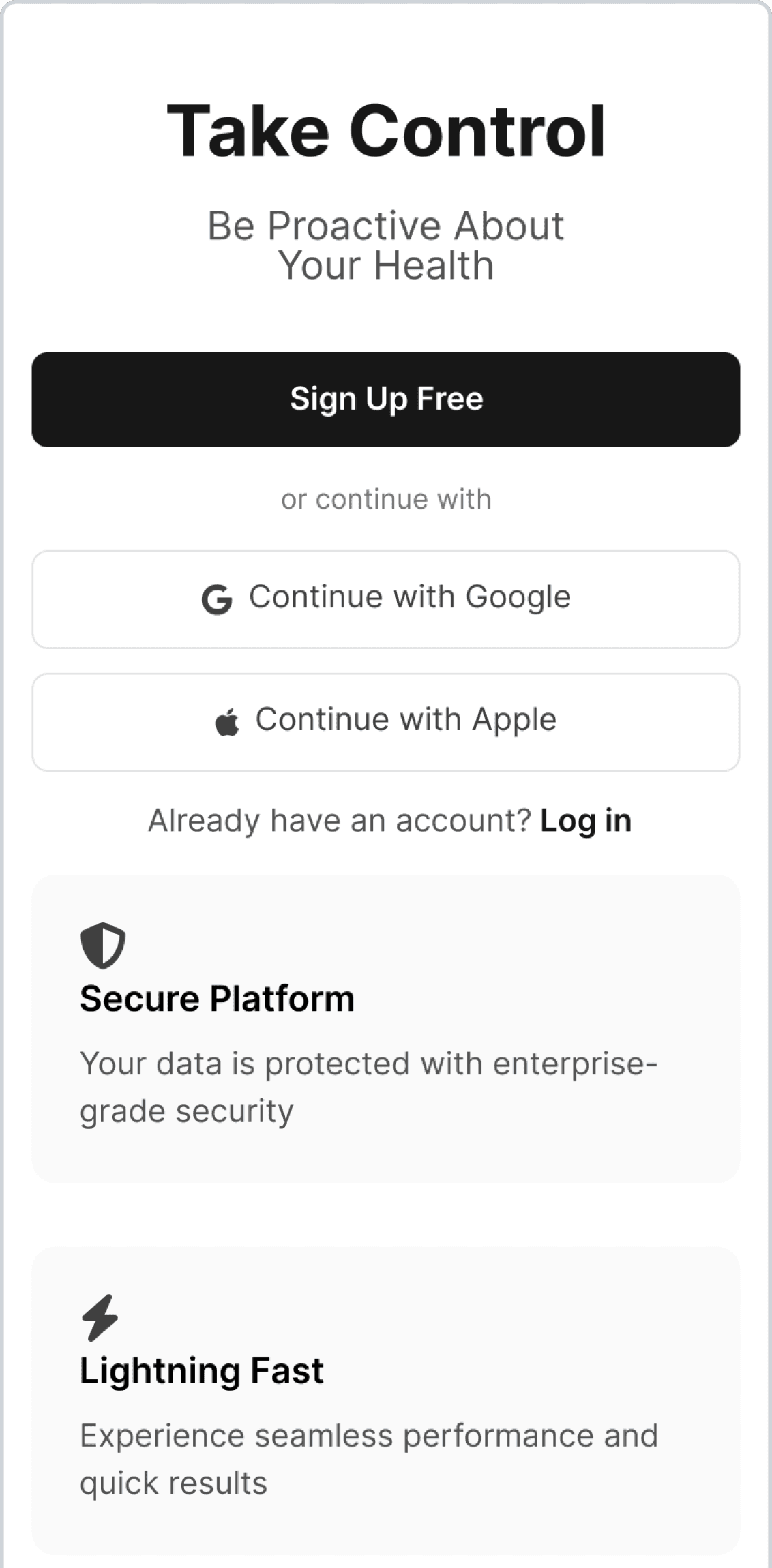
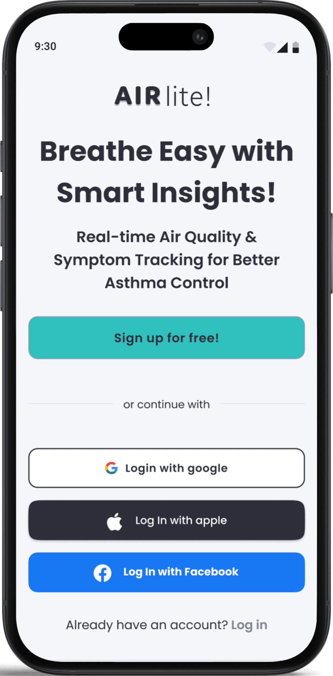
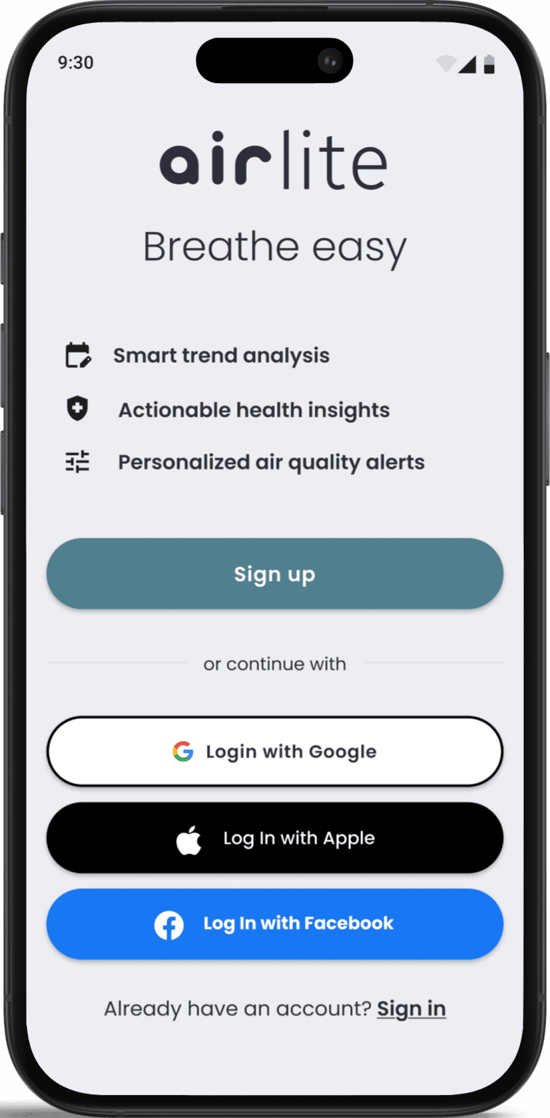
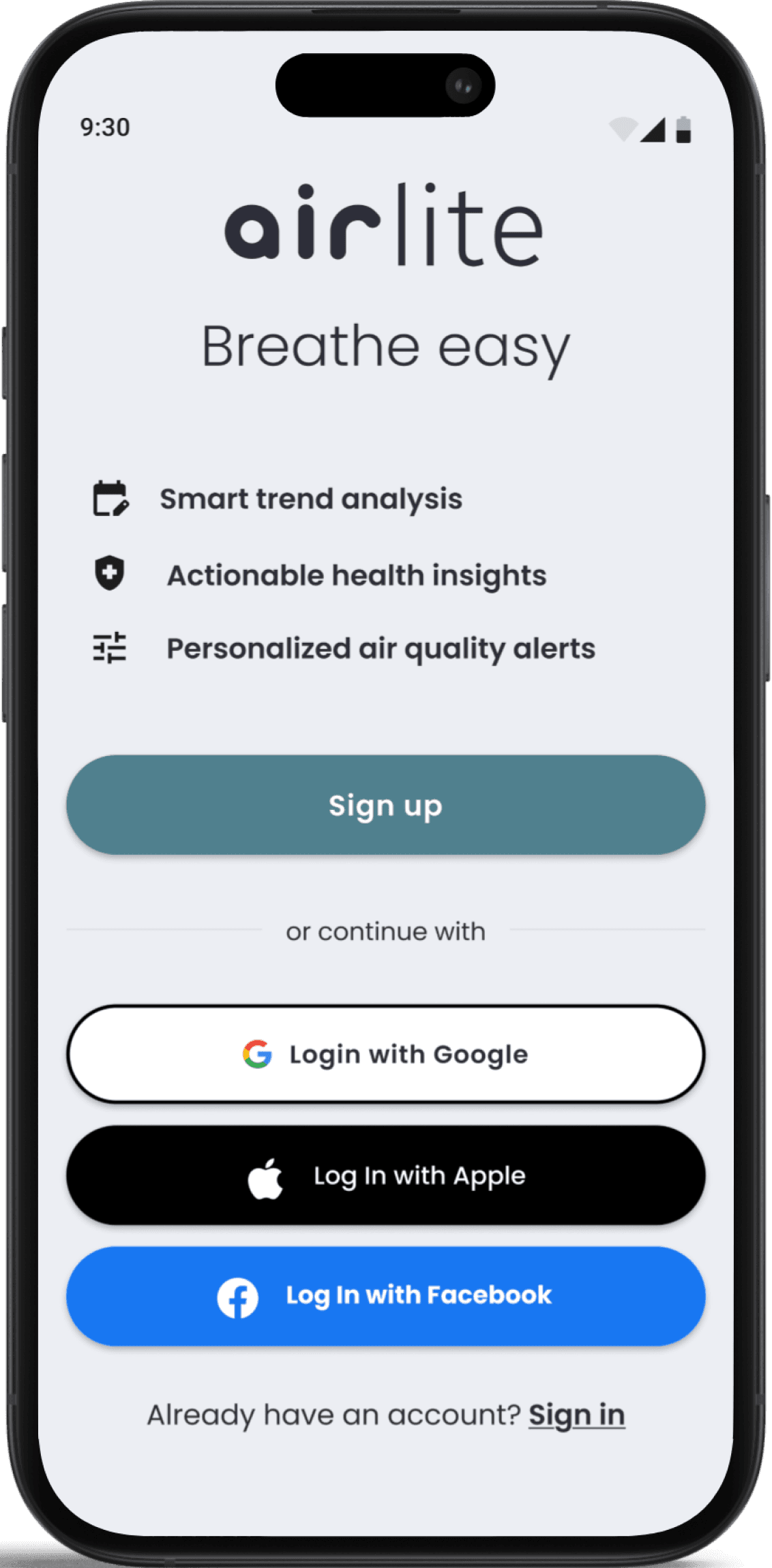
Welcome
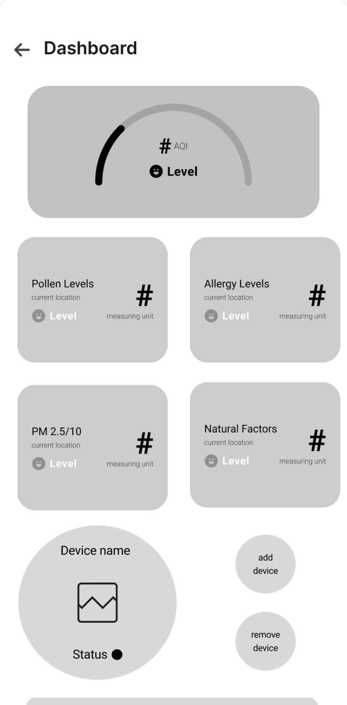
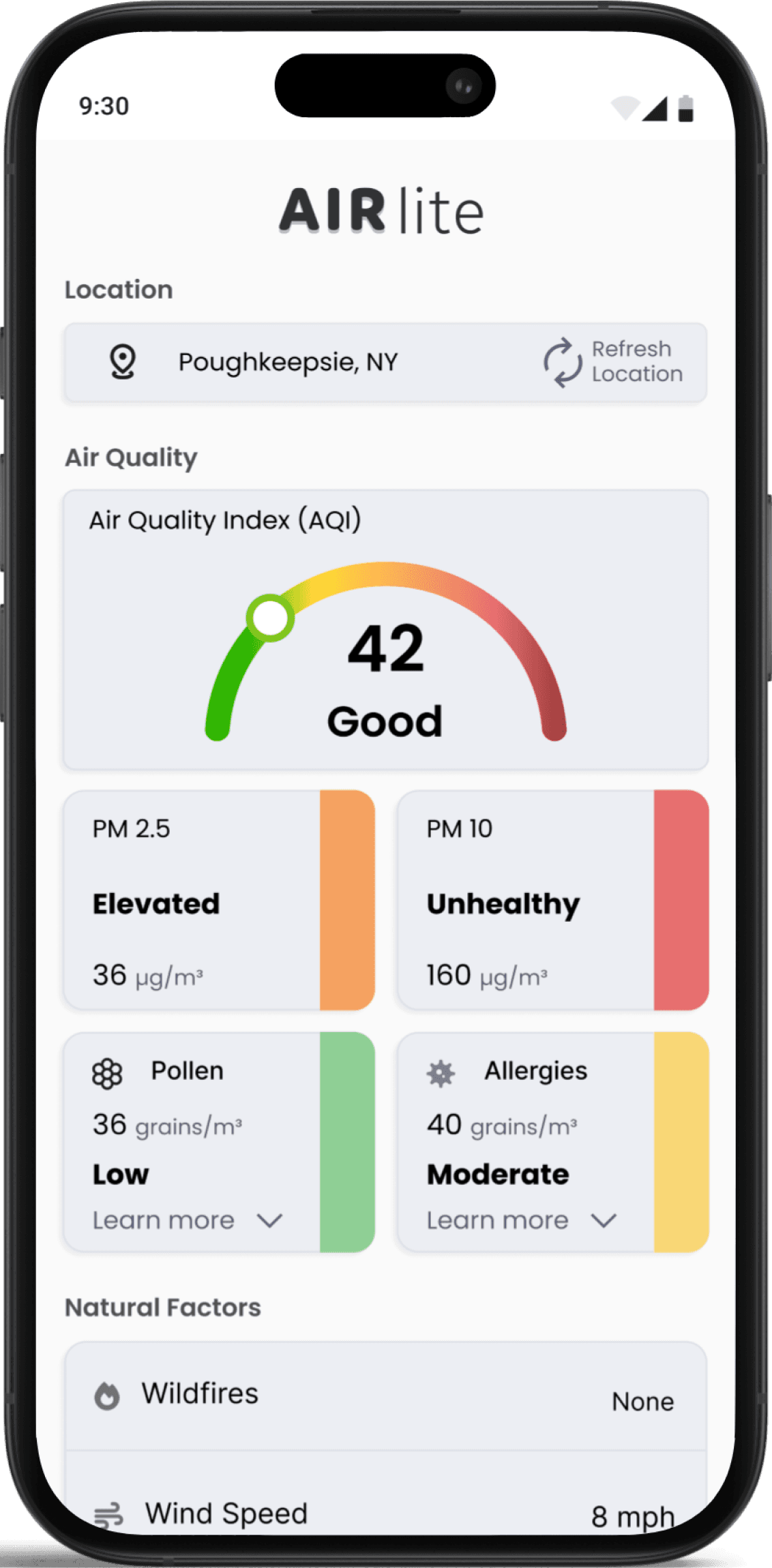
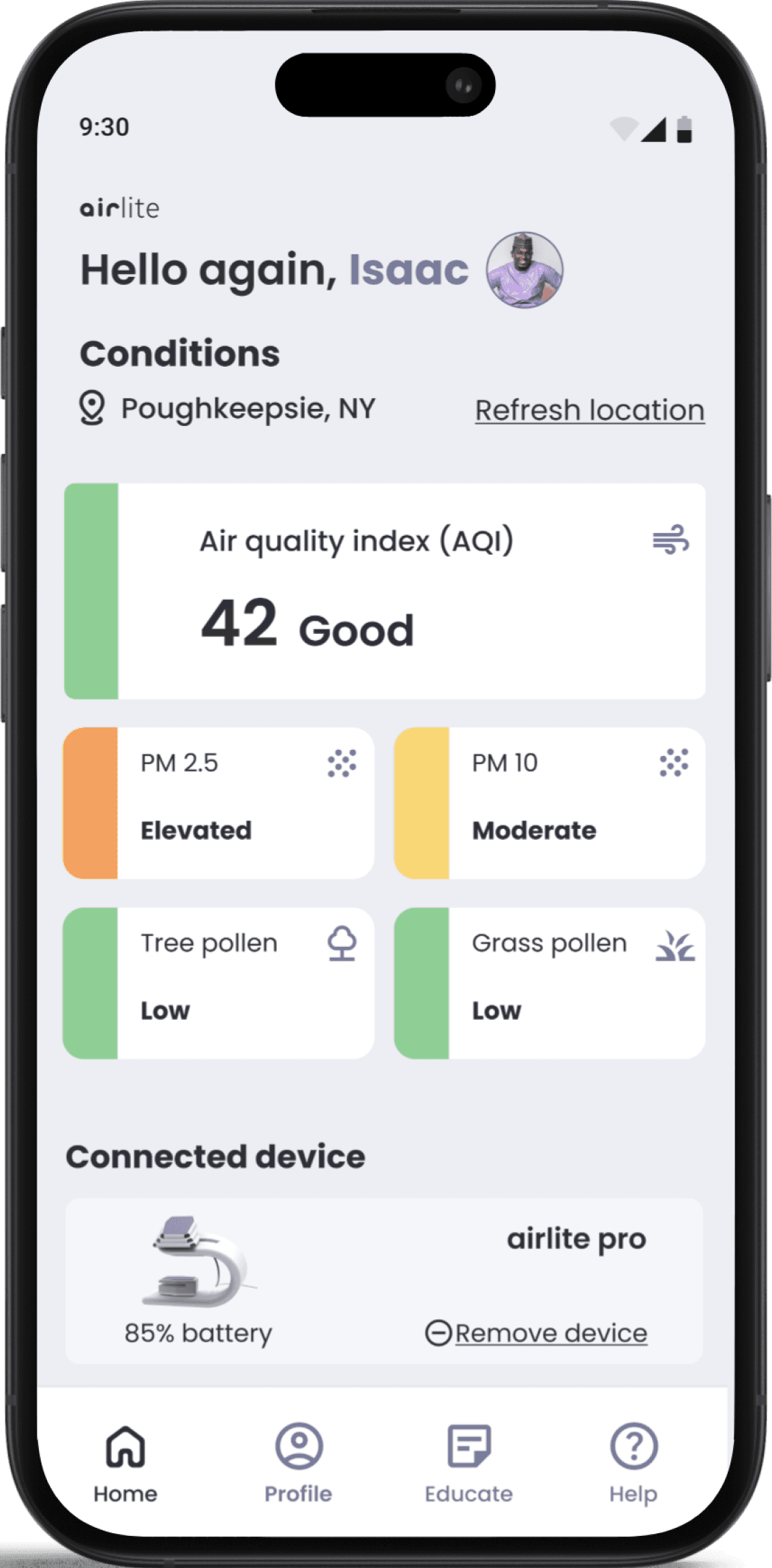
Dashboard
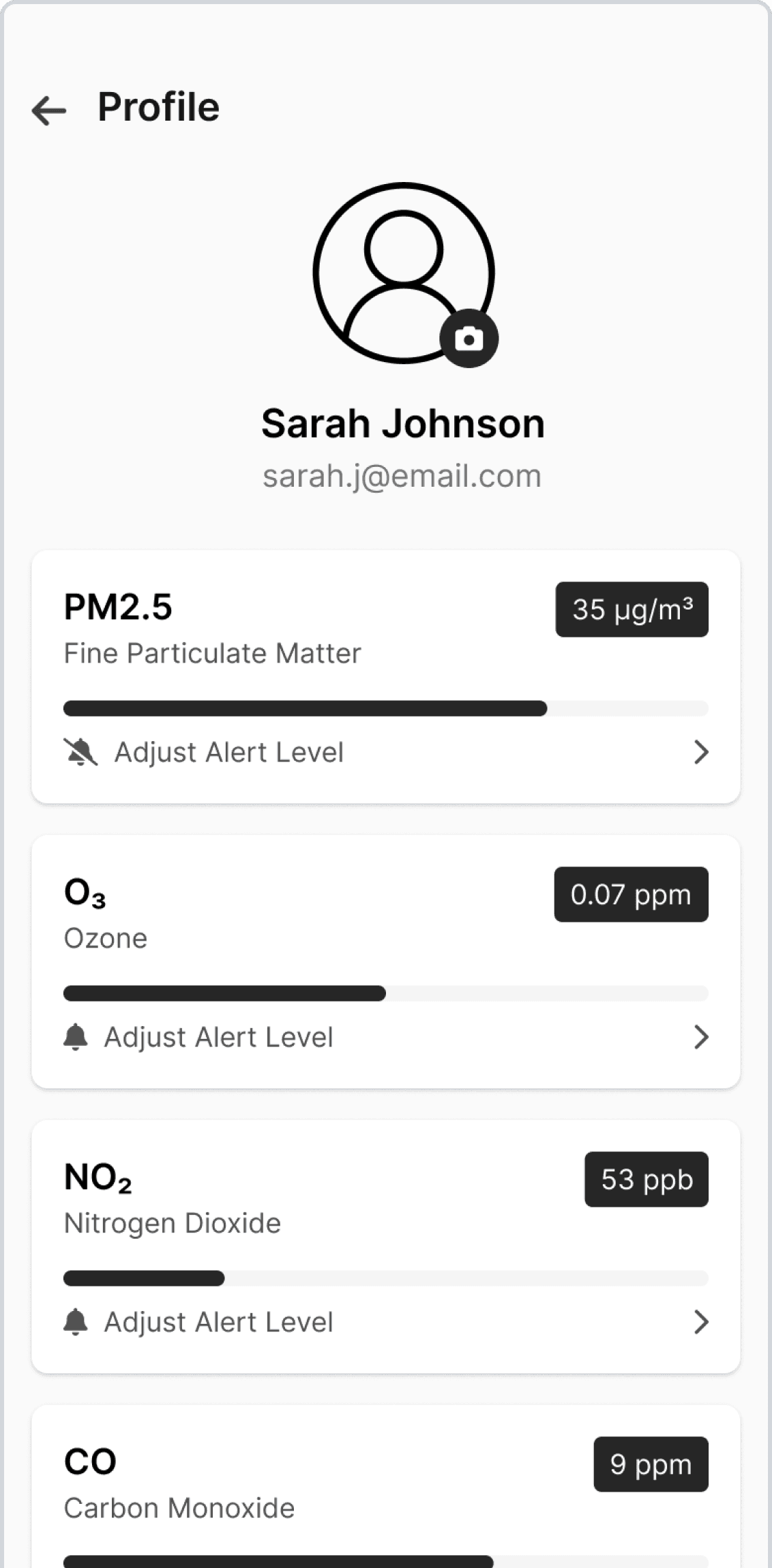
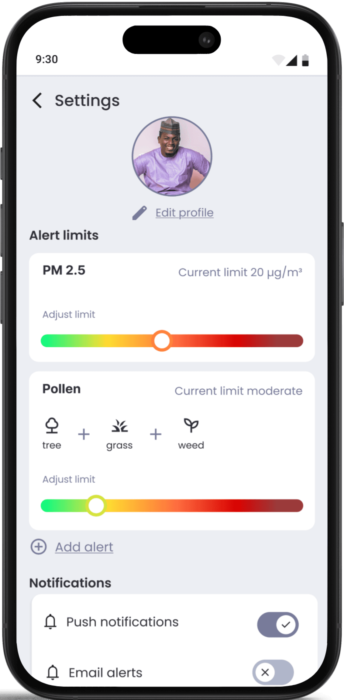
Profile
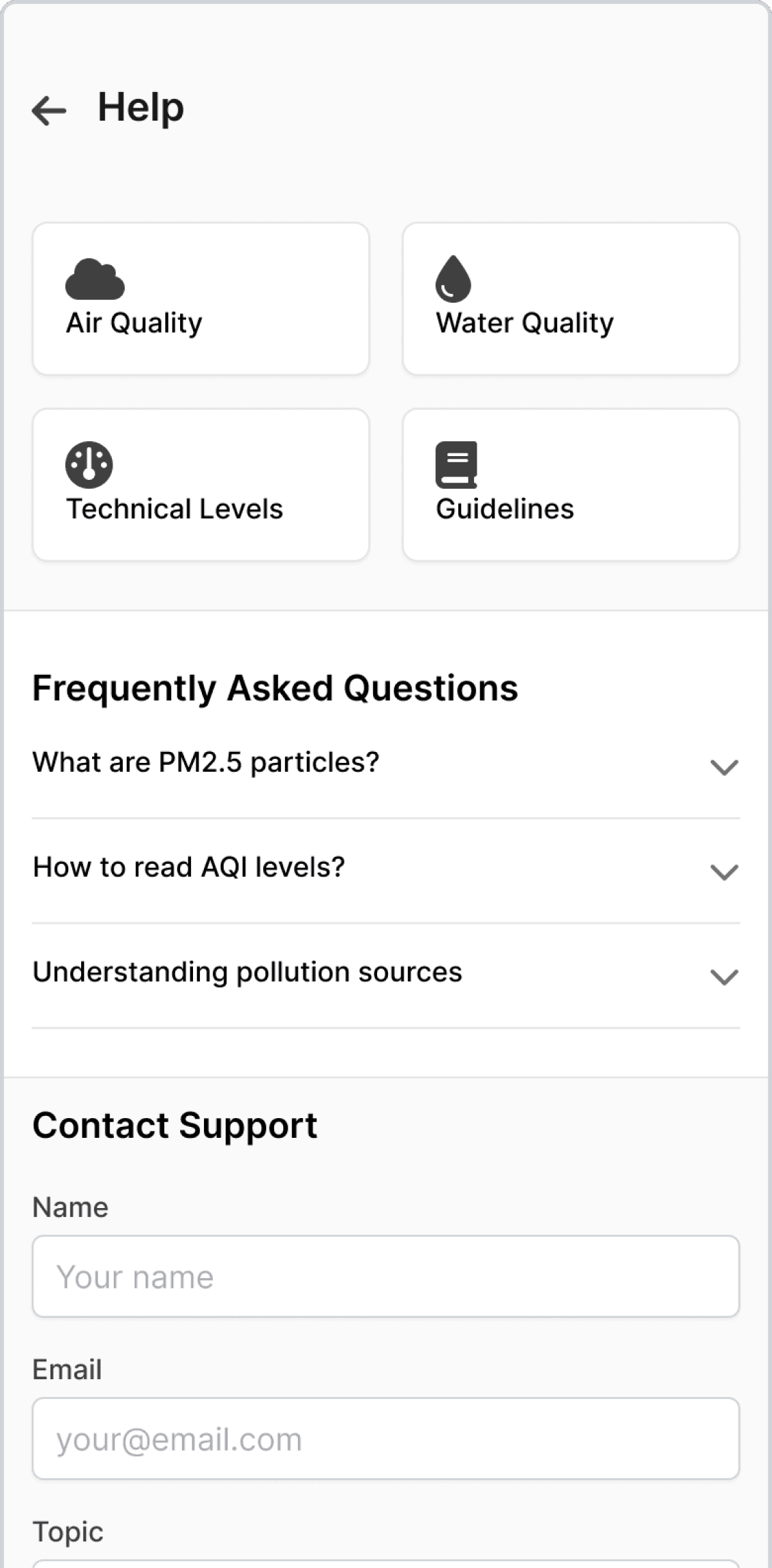
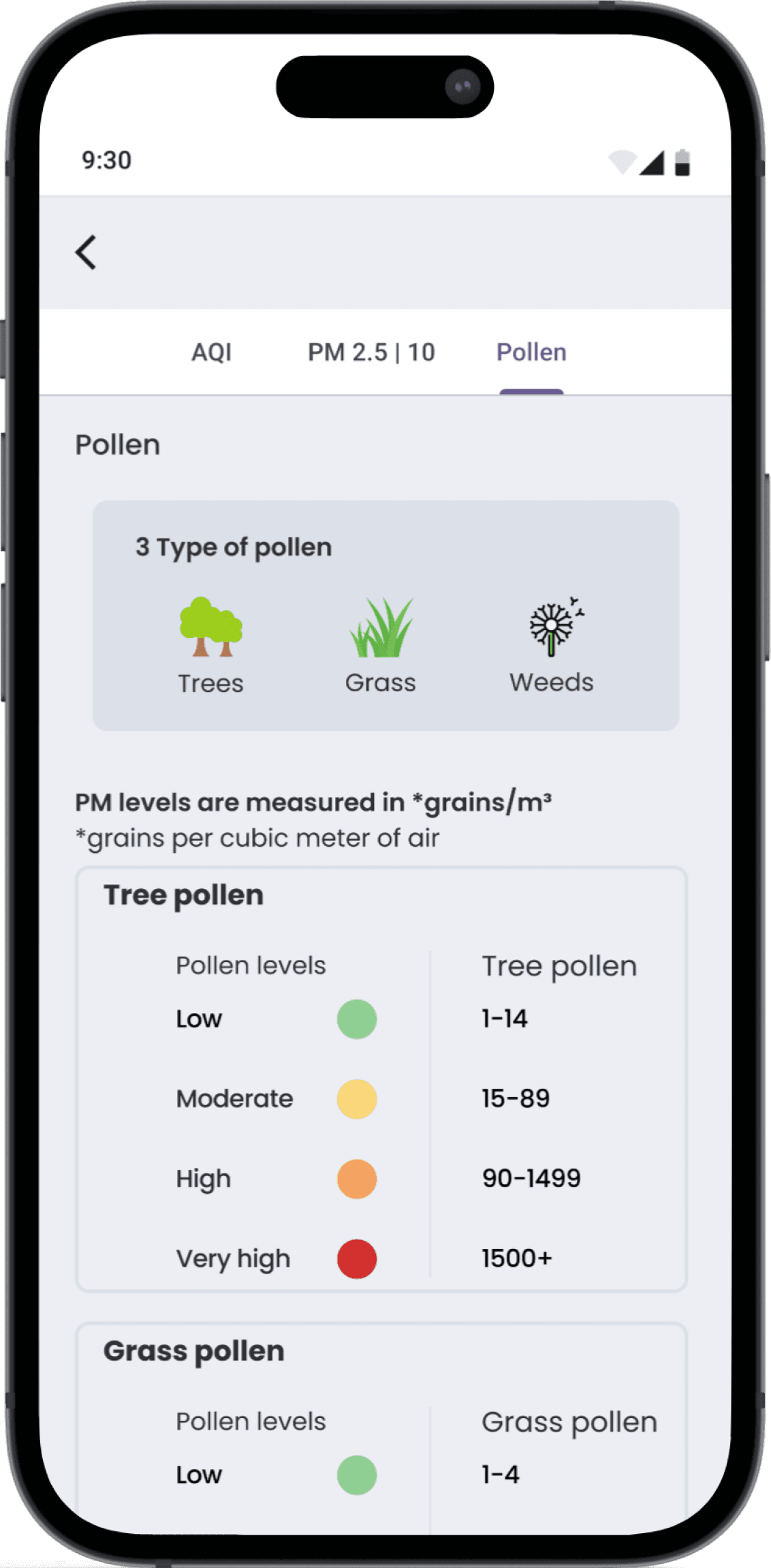
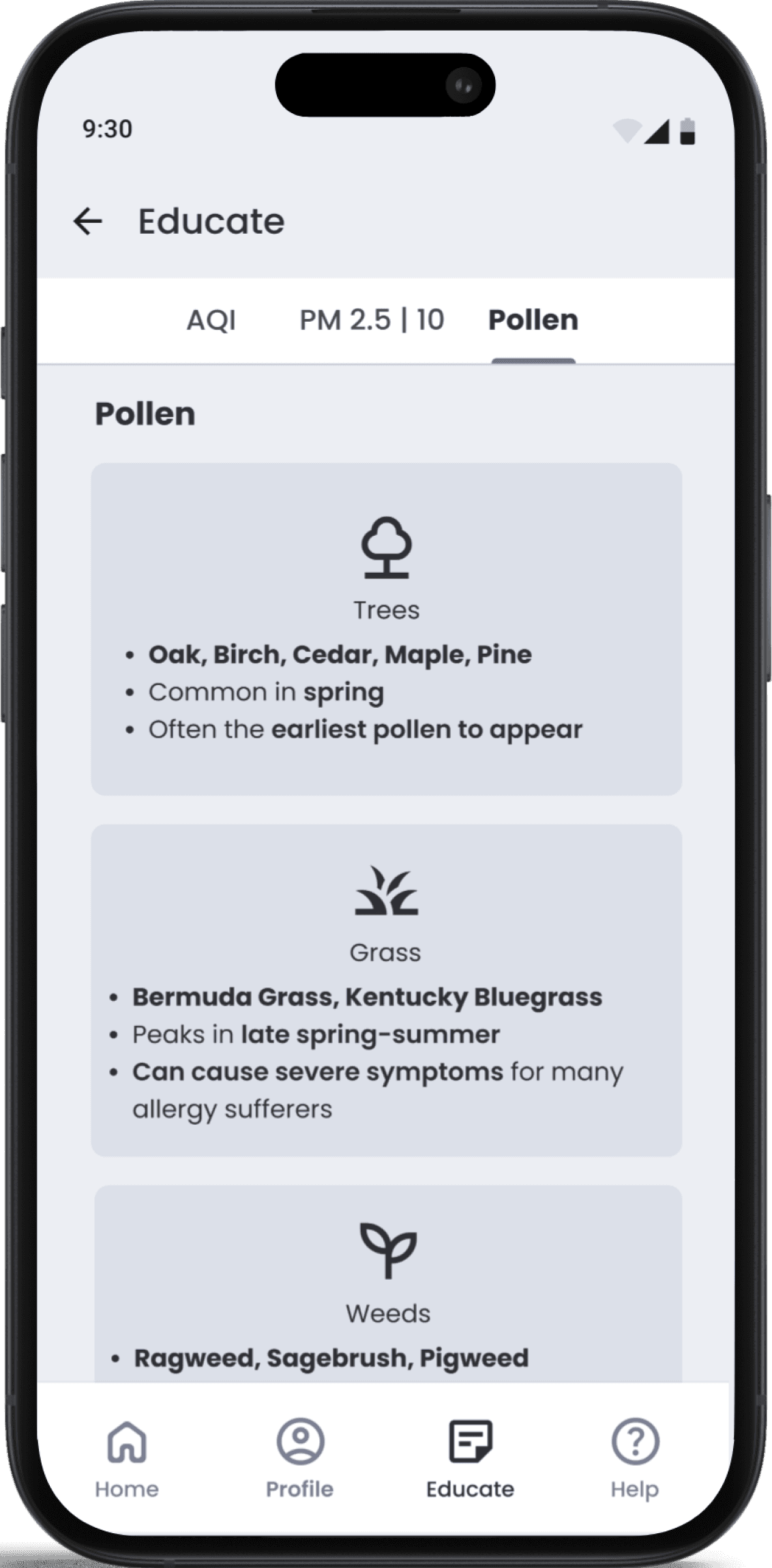
Educate
High-Fidelity Designs
Welcome
Dashboard
Profile
Learn
Usability Testing
What Users Said
“The interactive slider for choosing air quality levels is easy to use, but it feels overly sensitive and doesn't clearly show the selected value.”
– Participant from Ukraine
“The AQI scale looks good, but it's very similar to the adjustable scale on the settings page.”
– Participant from Massachusetts
“In the pollutant cards on the dashboard, I really just want to quickly see if the air quality is good or bad. Simplifying this information into clear status indicators would help me understand the air quality at a glance.”
– Participant from New Hampshire
Key Findings
Users found the concept intuitive in initial testing
Challenges included visual overload, confusing labels, and inconsistent color cues
Refined visual hierarchy and simplified UI elements to address issues
Clarified air quality terminology for better understanding
Changes reduced cognitive friction and improved quick scanning of critical health info
Design Iterations & Improvements
Landing
Before
After
1
2
3
4
Design Refinements
1
Enhanced logo clarity for stronger brand presence.
2
Streamlined benefit text to improve scannability.
3
Simplified CTA design for a cleaner visual hierarchy.
4
Increased button contrast to improve visibility and emphasis.
Dashboard
Before
After
1
2
3
4
Design Refinements
1
Clearer personalization.
2
Consistent, unified pollutant card design
3
Cleaner, more readable pollutant cards.
4
Streamlined content to highlight key metrics.
4
Increased button contrast to improve visibility and emphasis.
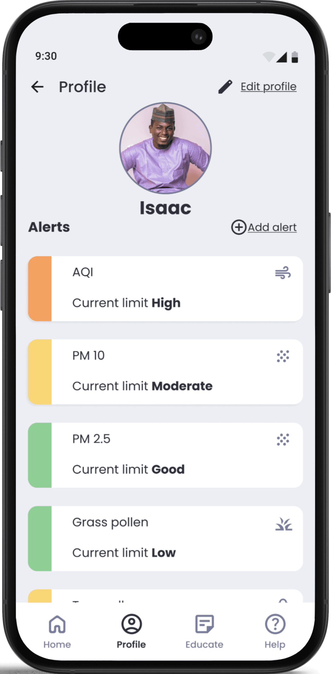
Profile
Before
After

1
2
3
Design Refinements
1
Improved button contrast for better visibility.
2
Replaced sliders with clearer, tap-based selection.
3
Defined color coding to enhance clarity.
4
Increased button contrast to improve visibility and emphasis.
Educate
Before
After
1
2
3
4
Design Refinements
1
Simplified icons to align with content and reduce distraction.
2
Highlighted common pollen types with seasonal context.
3
Added details about pollen timing and severity.
4
Simplified sections with key species and impact.
4
Increased button contrast to improve visibility and emphasis.
Deliver
The Airlite app:
Delivers real-time insights to help users stay ahead of asthma symptoms
Sends personalized alerts with customizable pollen and air quality thresholds
Features intuitive navigation and clear resources
Enables confident, informed management of respiratory health
Solution
Landing
Dashboard
Profile
Educate
Style Guide
