Black-bench
Build trust. Book more clients.
Build trust. Book more clients.
Clear messaging and layout that drive action.
Clear messaging and layout that drive action.
OVERVIEW
Problem
Problem
BlackBench’s website wasn’t converting because its value and credibility weren’t clear.
Key issues with the old site
Key issues with the old site
Clients couldn’t quickly answer the basics, which created drop-off.
Who is this for?
What’s being offered?
Why should I trust it?
Insufficient proof of credibility – Hard to tell the service was trustworthy
Unclear service options – Difficult to scan and compare services
Reaching out felt like a big commitment – No quick, low-risk way to get in touch
My Role
My Role
End-to-End Website Overhaul
Deliver
Solution
Solution
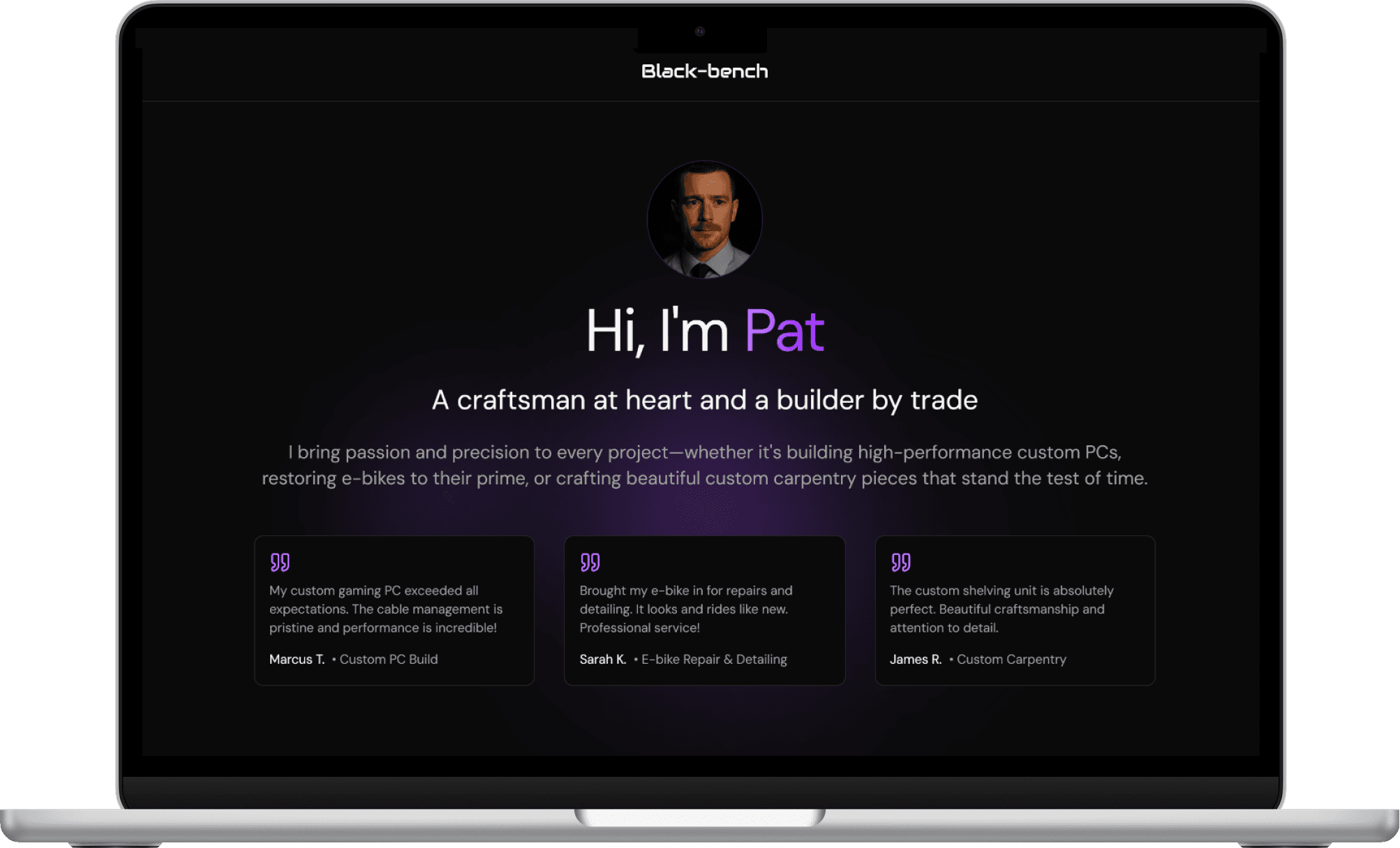
I restructured the experience into a single-page flow that answers core questions quickly: credibility, services, and next steps. Trust signals (testimonials) come early, services are presented in scannable cards, and company values reinforce expectations. The contact form was simplified to make reaching out feel easy and low risk.

1. Rebuilt the landing page
What I did
Clarified the hero to communicate who it’s for + what they do in seconds
Restructured the above-the-fold layout to reduce cognitive load
Consolidated content into one scannable, scrollable page
Why
Reduce ambiguity and decision friction
Improve comprehension and message clarity
Make the offering obvious at first glance

2) Added trust before the ask
What I did
Moved testimonials above the primary CTA
Added credible proof points early in the page flow
Strengthened social proof placement and visibility
Why
Reduce hesitation by validating credibility up front
Increase confidence before requesting action
Support higher click intent on the CTA

3) Made services easier to scan and compare
What I did
Reframed services into concise, consistent cards
Grouped related offerings for quicker comparison
Improved information density without overwhelming the page
Why
Help visitors understand options faster
Reduce effort required to compare services
Increase clarity and decision speed
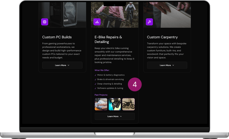
4) Introduced progressive disclosure
What I did
Added expandable service cards for details-on-demand
Kept the default view lightweight and uncluttered
Included visual previews that expand when needed
Why
Keep the page clean while still offering depth
Reduce unnecessary scrolling
Let users pull info when they’re ready

5) Highlighted values and differentiation
What I did
Added a “Why choose us” / values section
Translated values into tangible client benefits
Clarified what sets the company apart
Why
Build credibility beyond aesthetics
Give users reasons to choose this option over competitors
Reinforce brand trust and fit
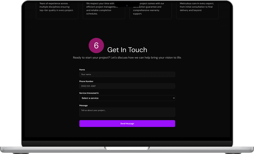
6) Reduced friction in the contact flow
What I did
Simplified the form to the minimum needed fields
Designed it as a low-commitment, friendly interaction
Improved mobile usability and readability
Why
Lower the barrier to starting a conversation
Increase form completion (especially on mobile)
Make outreach feel quick and approachable
1. Rebuilt the landing page
1. Rebuilt the landing page
What I did
Clarified the hero to communicate who it’s for + what they do in seconds
Restructured the above-the-fold layout to reduce cognitive load
Consolidated content into one scannable, scrollable page
Why
Reduce ambiguity and decision friction
Improve comprehension and message clarity
Make the offering obvious at first glance
2) Added trust before the ask
2) Added trust before the ask
What I did
Moved testimonials above the primary CTA
Added credible proof points early in the page flow
Strengthened social proof placement and visibility
Why
Reduce hesitation by validating credibility up front
Increase confidence before requesting action
Support higher click intent on the CTA
3) Made services easier to scan and compare
3) Made services easier to scan and compare
What I did
Reframed services into concise, consistent cards
Grouped related offerings for quicker comparison
Improved information density without overwhelming the page
Why
Help visitors understand options faster
Reduce effort required to compare services
Increase clarity and decision speed
4) Introduced progressive disclosure
4) Introduced progressive disclosure
What I did
Added expandable service cards for details-on-demand
Kept the default view lightweight and uncluttered
Included visual previews that expand when needed
Why
Keep the page clean while still offering depth
Reduce unnecessary scrolling
Let users pull info when they’re ready
5) Highlighted values and differentiation
5) Highlighted values and differentiation
What I did
Added a “Why choose us” / values section
Translated values into tangible client benefits
Clarified what sets the company apart
Why
Build credibility beyond aesthetics
Give users reasons to choose this option over competitors
Reinforce brand trust and fit
6) Reduced friction in the contact flow
6) Reduced friction in the contact flow
What I did
Simplified the form to the minimum needed fields
Designed it as a low-commitment, friendly interaction
Improved mobile usability and readability
Why
Lower the barrier to starting a conversation
Increase form completion (especially on mobile)
Make outreach feel quick and approachable
Deliver
Result
Result
In the 4 months after launch, the redesign reduced bounce rate by 33% and increased inquiries by 25%.

Black-bench
Build trust. Book more clients.
Clear messaging and layout that drive action.
OVERVIEW
Problem
BlackBench’s website wasn’t converting because its value and credibility weren’t clear.
Key issues with the old site
Clients couldn’t quickly answer the basics, which created drop-off.
Who is this for?
What’s being offered?
Why should I trust it?
Insufficient proof of credibility – Hard to tell the service was trustworthy
Unclear service options – Difficult to scan and compare services
Reaching out felt like a big commitment – No quick, low-risk way to get in touch
My Role
End-to-End Website Overhaul
Deliver
Solution
I restructured the experience into a single-page flow that answers core questions quickly: credibility, services, and next steps. Trust signals (testimonials) come early, services are presented in scannable cards, and company values reinforce expectations. The contact form was simplified to make reaching out feel easy and low risk.
1. Rebuilt the landing page
What I did
Clarified the hero to communicate who it’s for + what they do in seconds
Restructured the above-the-fold layout to reduce cognitive load
Consolidated content into one scannable, scrollable page
Why
Reduce ambiguity and decision friction
Improve comprehension and message clarity
Make the offering obvious at first glance
2) Added trust before the ask
What I did
Moved testimonials above the primary CTA
Added credible proof points early in the page flow
Strengthened social proof placement and visibility
Why
Reduce hesitation by validating credibility up front
Increase confidence before requesting action
Support higher click intent on the CTA
3) Made services easier to scan and compare
What I did
Reframed services into concise, consistent cards
Grouped related offerings for quicker comparison
Improved information density without overwhelming the page
Why
Help visitors understand options faster
Reduce effort required to compare services
Increase clarity and decision speed
4) Introduced progressive disclosure
What I did
Added expandable service cards for details-on-demand
Kept the default view lightweight and uncluttered
Included visual previews that expand when needed
Why
Keep the page clean while still offering depth
Reduce unnecessary scrolling
Let users pull info when they’re ready
5) Highlighted values and differentiation
What I did
Added a “Why choose us” / values section
Translated values into tangible client benefits
Clarified what sets the company apart
Why
Build credibility beyond aesthetics
Give users reasons to choose this option over competitors
Reinforce brand trust and fit
6) Reduced friction in the contact flow
What I did
Simplified the form to the minimum needed fields
Designed it as a low-commitment, friendly interaction
Improved mobile usability and readability
Why
Lower the barrier to starting a conversation
Increase form completion (especially on mobile)
Make outreach feel quick and approachable
Deliver
Result
In the 4 months after launch, the redesign reduced bounce rate by 33% and increased inquiries by 25%.