Airlite
Breathe easy. Live smarter.
Breathe easy.
Live smarter.
Breathe easy. Live smarter.
Take control of your health with real-time air quality insights
Take control of your health with real-time air quality insights
Take control of your health with real-time air quality insights
OVERVIEW
Problem
Problem
Problem
The air we breathe is harming us — and we might not even realize it.
The air we breathe is harming us — and we might not even realize it.
137M+ at risk – Americans breathe unhealthy air
137M+ at risk – Americans breathe unhealthy air
Lack of awareness – Most can’t track exposure or symptoms
Lack of awareness – Most can’t track exposure or symptoms
Goal
Goal
Goal
Enable people to take control of their health by monitoring and responding to air quality risks in real time.
Enable people to take control of their health by monitoring and responding to air quality risks in real time.
Deliver personalized insights tailored to individual health conditions, daily habits, and location.
Deliver personalized insights tailored to individual health conditions, daily habits, and location.
Build awareness of air quality patterns and trends using clear, ongoing data.
Build awareness of air quality patterns and trends using clear, ongoing data.
Promote healthier communities by reducing exposure to harmful pollutants.
Promote healthier communities by reducing exposure to harmful pollutants.
My Role
My Role
My Role
Led end-to-end UX—from physical device comfort to intuitive mobile workflows.
Led end-to-end UX—from physical device comfort to intuitive mobile workflows.
DISCOVER
Research
Research
Research
We kicked off our research with a competitive analysis to gain a solid understanding of the market landscape. This helped us spot trends, gaps, and opportunities—guiding more focused, relevant questions during user interviews and ensuring we uncovered meaningful insights tied to real user pain points.
We kicked off our research with a competitive analysis to gain a solid understanding of the market landscape. This helped us spot trends, gaps, and opportunities—guiding more focused, relevant questions during user interviews and ensuring we uncovered meaningful insights tied to real user pain points.
We kicked off our research with a competitive analysis to gain a solid understanding of the market landscape. This helped us spot trends, gaps, and opportunities—guiding more focused, relevant questions during user interviews and ensuring we uncovered meaningful insights tied to real user pain points.
SWOT framework for prudcts currently on the market
SWOT framework for prudcts currently on the market
SWOT framework for prudcts currently on the market
Strengths
Strengths
Real-time air quality + health tracking
Smart home integration
Emergency alerts + symptom logging
Weaknesses
Weaknesses
Too technical for average users
Clunky UI for newcomers
Low personalization
Opportunities
Opportunities
Simplify UX for broader reach
Add customizable alerts
Brand as a holistic air health tool
Threats
Threats
Strong existing competition
Data privacy shifts
Risk of AI overreliance
DISCOVER
Interviews
Interviews
Interviews
To deepen product insight and guide user-centered strategy, I conducted qualitative interviews with a targeted demographic reflecting our audience. The goal was to uncover friction points, unmet needs, and emotional drivers behind product use.
To deepen product insight and guide user-centered strategy, I conducted qualitative interviews with a targeted demographic reflecting our audience. The goal was to uncover friction points, unmet needs, and emotional drivers behind product use.
To deepen product insight and guide user-centered strategy, I conducted qualitative interviews with a targeted demographic reflecting our audience. The goal was to uncover friction points, unmet needs, and emotional drivers behind product use.
Key Findings
Key Findings
Key Findings
Users struggle to access and interpret real-time air quality data to take meaningful action.
People with asthma, allergies, and respiratory issues need a more accessible, user-friendly solution.
Clear, personalized warnings and recommendations are vital for managing air quality risks.
Simplicity and ease of use drive adoption and daily engagement.
I don’t always remember to check air quality, but if I got a notification telling me the air was bad today, I’d definitely pay attention.


Eli from California
MassArt Student
I don’t have time to research what air quality levels mean. Just tell me if it’s safe to take my kids to the park. x

Ravi from Texas
Wentworth Student
There’s just so much information. Different numbers, colors, and terms. I’m not sure what it all means or what I’m supposed to do with it.

Claire from Illinois
BU Student
I don’t always remember to check air quality, but if I got a notification telling me the air was bad today, I’d definitely pay attention.
Eli from California
MassArt Student
I don’t have time to research what air quality levels mean. Just tell me if it’s safe to take my kids to the park. x
Ravi from Texas
Wentworth Student
There’s just so much information. Different numbers, colors, and terms. I’m not sure what it all means or what I’m supposed to do with it.
Claire from Illinois
BU Student
I don’t always remember to check air quality, but if I got a notification telling me the air was bad today, I’d definitely pay attention.
Eli from California
MassArt Student
I don’t always remember to check air quality, but if I got a notification telling me the air was bad today, I’d definitely pay attention.
Eli from California
MassArt Student
I don’t have time to research what air quality levels mean. Just tell me if it’s safe to take my kids to the park. x
Ravi from Texas
Wentworth Student
I don’t have time to research what air quality levels mean. Just tell me if it’s safe to take my kids to the park. x
Ravi from Texas
Wentworth Student
There’s just so much information. Different numbers, colors, and terms. I’m not sure what it all means or what I’m supposed to do with it.
Claire from Illinois
BU Student
There’s just so much information. Different numbers, colors, and terms. I’m not sure what it all means or what I’m supposed to do with it.
Claire from Illinois
BU Student
DEFINE
DEFINE
Identifying Our Target Users
Identifying Our Target Users
Identifying Our Target Users
We pulled together insights from our research and interviews to identify our target users. From there, we created personas to keep the team focused on solving the right problems.
We pulled together insights from our research and interviews to identify our target users. From there, we created personas to keep the team focused on solving the right problems.
We pulled together insights from our research and interviews to identify our target users. From there, we created personas to keep the team focused on solving the right problems.


DISCOVER
Aligning Business Goals and User Needs
Aligning Business Goals and User Needs
Aligning Business Goals and User Needs
As part of our strategy, we mapped core user insights directly to business objectives—ensuring design decisions added value for both the customer and the brand. Our goals were:
As part of our strategy, we mapped core user insights directly to business objectives—ensuring design decisions added value for both the customer and the brand. Our goals were:
As part of our strategy, we mapped core user insights directly to business objectives—ensuring design decisions added value for both the customer and the brand. Our goals were:
Increase customer trust and retention by helping users confidently monitor and manage air quality.
Strengthen brand positioning through clear alerts and easy-to-use interfaces.
Drive adoption and engagement through personalized insights that appeal to a broader audience.
Turn complex air quality data into meaningful actions that drive user engagement.
Keeping personas at the center of design allowed us to create solutions that resonated with different user types.
Keeping personas at the center of design allowed us to create solutions that resonated with different user types.
Keeping personas at the center of design allowed us to create solutions that resonated with different user types.
Individuals living with asthma:
Individuals living with asthma:
Individuals living with asthma:
How might we help them monitor air quality and symptoms to reduce exposure and manage flare-ups more effectively?
How might we help them monitor air quality and symptoms to reduce exposure and manage flare-ups more effectively?
Air quality-conscious users:
Air quality-conscious users:
Air quality-conscious users:
How might we provide real-time and forecasted data to help them minimize exposure and protect their health?
How might we provide real-time and forecasted data to help them minimize exposure and protect their health?
Outdoor workers:
Outdoor workers:
Outdoor workers:
How might we deliver timely alerts so they can act quickly during poor air quality conditions?
How might we deliver timely alerts so they can act quickly during poor air quality conditions?
Caregivers:
Caregivers:
Caregivers:
How might we enable them to track air quality and symptoms to proactively manage asthma risks for loved ones?
How might we enable them to track air quality and symptoms to proactively manage asthma risks for loved ones?
DEVELOP
DEVELOP
Conceptual Wireframe
Conceptual Wireframe
Conceptual Wireframe
Due to a tight project timeline, we prioritized speed and clarity by jumping directly into mid-fidelity wireframes. This allowed us to quickly visualize core user flows, validate layout decisions, and align the team on key features without getting bogged down in early-stage sketches.
Due to a tight project timeline, we prioritized speed and clarity by jumping directly into mid-fidelity wireframes. This allowed us to quickly visualize core user flows, validate layout decisions, and align the team on key features without getting bogged down in early-stage sketches.
Due to a tight project timeline, we prioritized speed and clarity by jumping directly into mid-fidelity wireframes. This allowed us to quickly visualize core user flows, validate layout decisions, and align the team on key features without getting bogged down in early-stage sketches.
Welcome Screen

Dashboard Screen

Settings Screen
Settings Screen

Learn Screen
Learn Screen

DEVELOP
Initial High-Fidelity UI Exploration
Initial High-Fidelity UI Exploration
Initial High-Fidelity UI Exploration
Core screens to validate layout, hierarchy, and primary user flows
Core screens to validate layout, hierarchy, and primary user flows
Core screens to validate layout, hierarchy, and primary user flows

Welcome Screen

Dashboard Screen

Settings Screen

Learn Screen
Welcome Screen
Dashboard Screen
Settings Screen
Learn Screen
DISCOVER
First round usability testing
First round usability testing
First round usability testing
Usability tests were conducted to help guide or confirm initial design decisions. Users were asked to perform some key flows. Tests were done both moderated and unmoderated.
Usability tests were conducted to help guide or confirm initial design decisions. Users were asked to perform some key flows. Tests were done both moderated and unmoderated.
Usability tests were conducted to help guide or confirm initial design decisions. Users were asked to perform some key flows. Tests were done both moderated and unmoderated.
Key Findings
Key Findings
Key Findings
Users quickly grasped the core concept.
Visual clutter, unclear labels, and inconsistent color use were frequent issues.
UI hierarchy felt disjointed.
Some terminology was unclear or unfamiliar.
Users had trouble scanning the layout for suggestions.
“The AQI scale looks good, but it's too similar to the adjustable scale in the settings.” nmmmmmmmmmmmmmmmxxxxxxxxxxxxxxxxxxxxxxxxx

Jasmine
Teacher, Colorado
“The AQI scale looks good, but it's too similar to the adjustable scale in the settings.” nmmmmmmmmmmmmmmmxxxxxxxxxxxxxxxxxxxxxxxxx
Jasmine
Teacher, Colorado
“In the pollutant cards on the dashboard, I really just want to quickly see if the air quality is good or bad.” c

Matt
Architect, Minnesota
“In the pollutant cards on the dashboard, I really just want to quickly see if the air quality is good or bad.” c
Matt
Architect, Minnesota
“The interactive slider for choosing air quality levels is easy to use, but it feels overly sensitive and doesn't clearly display the selected value.”

Olga
Student, Ukraine
“The interactive slider for choosing air quality levels is easy to use, but it feels overly sensitive and doesn't clearly display the selected value.”
Olga
Student, Ukraine
DEVELOP
Design Iteration based on user testing and feedback
Design Iteration based on user testing and feedback
Design Iteration based on user testing and feedback
Shows the design decisions made during the 2nd round interation
Shows the design decisions made during the 2nd round interation
Shows the design decisions made during the 2nd round interation
Before
After

1
2
3
4
Welcome Screen Design Refinements
1
Updated visual identity
2
Clear branding value
3
CTA hierarchy felt disjointed
4
Simplified onboarding flow
Before
After
1
2
3
4

1
2
3
4
Dashboard Screen Design Refinements
Welcome Screen Design Refinements
1
Customized summary for the day
Updated visual identity
2
Pollutant categories added for clarity
Clear branding value
3
Simplified data cards
CTA hierarchy felt disjointed
4
Source and update status
Simplified onboarding flow
Before
Before
After
After
1
2
3
4
Dashboard Screen Design Refinements
Dashboard Screen Design Refinements
Dashboard Screen Design Refinements
1
Customized summary for the day
Customized summary
Customized summary for the day
1
2
Customized summary for the day
Pollutant categories for clarity
Customized summary for the day
2
Pollutant categories added for clarity
3
Simplified data cards
Simplified data cards
4
Source and update status
Source and update status
Before
After

3
2
1
Settings Screen Design Refinements
1
Simplified header
2
Condition toggles
3
Pollutant categories for clarity
Before
After

3
1
2
Learn Screen Design Refinements
1
Consistent category navigation
2
Improved heading structure
3
Clearer, more complete information
DELIVER
DELIVER
Final Solution
Final Solution
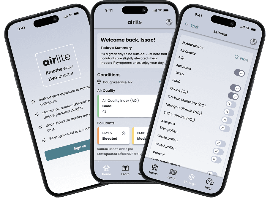
Airlite’s High-Fidelity Design Empowers Users Through Clarity, Control, and Confidence
Airlite’s High-Fidelity Design Empowers Users Through Clarity, Control, and Confidence
Delivers real-time insights to help users stay proactive
Features intuitive navigation and clear resources
Sends personalized alerts
Helps users manage respiratory health with confidence
Welcome
Welcome Screen
Dashboard
Dashboard Screen

Settings
Settings Screen
Learn
Learn Screen
DELIVER
Prototype
Prototype
Prototype
Customizing Alerts: Task Flow Highlight
Customizing Alerts: Task Flow Highlight
Customizing Alerts: Task Flow Highlight
One of the key interactive flows within the Airlite prototype is the ability to customize air quality and allergen alerts based on user needs. This flow supports proactive health management through a few intuitive steps:
One of the key interactive flows within the Airlite prototype is the ability to customize air quality and allergen alerts based on user needs. This flow supports proactive health management through a few intuitive steps:
DELIVER
Closing Reflections
Closing Reflections
Closing Reflections
Designing Airlite was a valuable opportunity to translate real user needs into meaningful solutions. From early usability insights to refined high-fidelity interactions, the project focused on empowering users to manage their respiratory health with confidence. Key takeaways included the importance of clarity in UI design, accessibility in information architecture, and flexibility in personalization.
Designing Airlite was a valuable opportunity to translate real user needs into meaningful solutions. From early usability insights to refined high-fidelity interactions, the project focused on empowering users to manage their respiratory health with confidence. Key takeaways included the importance of clarity in UI design, accessibility in information architecture, and flexibility in personalization.