secret escapes
secret escapes
secret escapes
Responsive Redesign
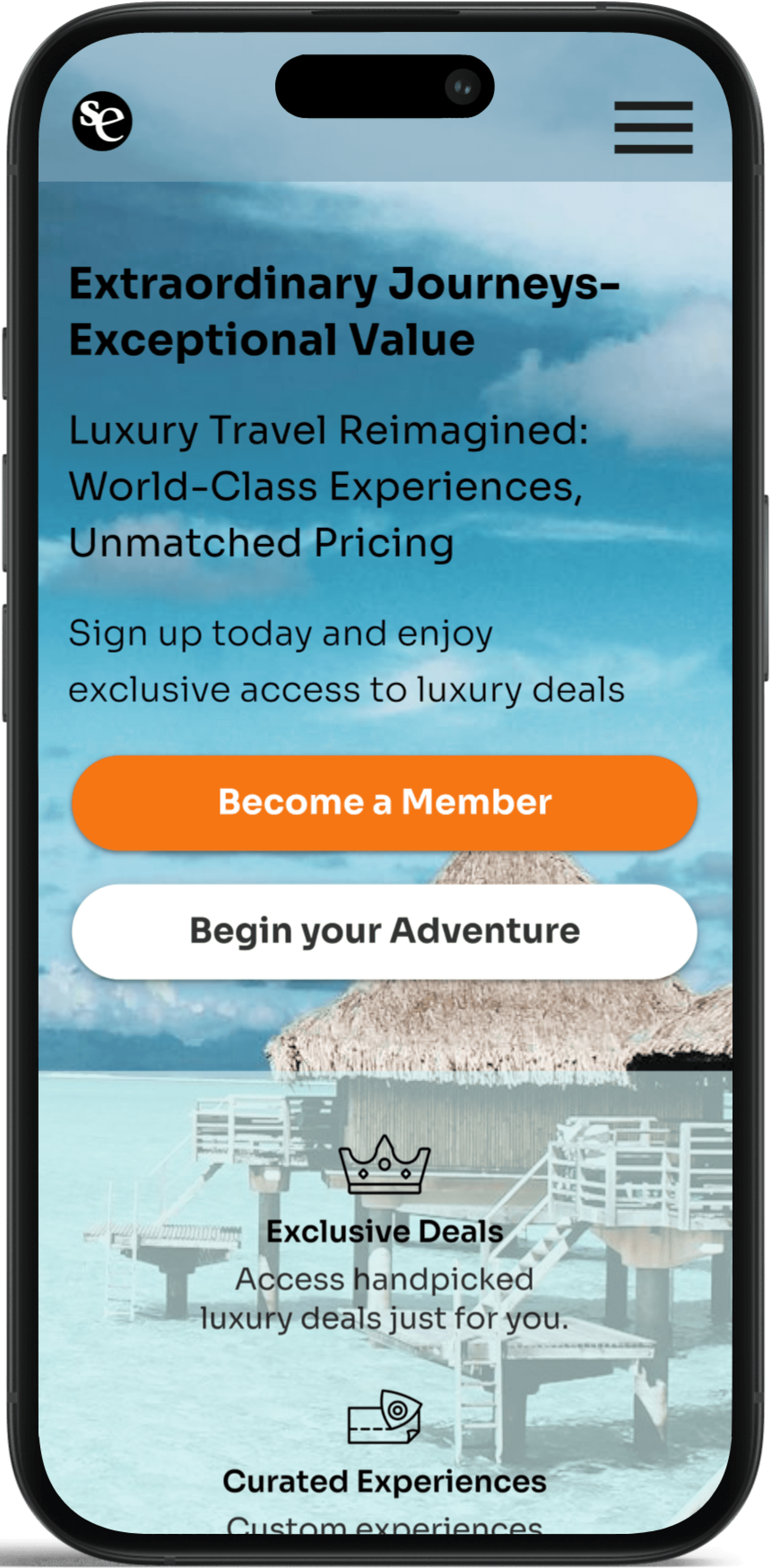
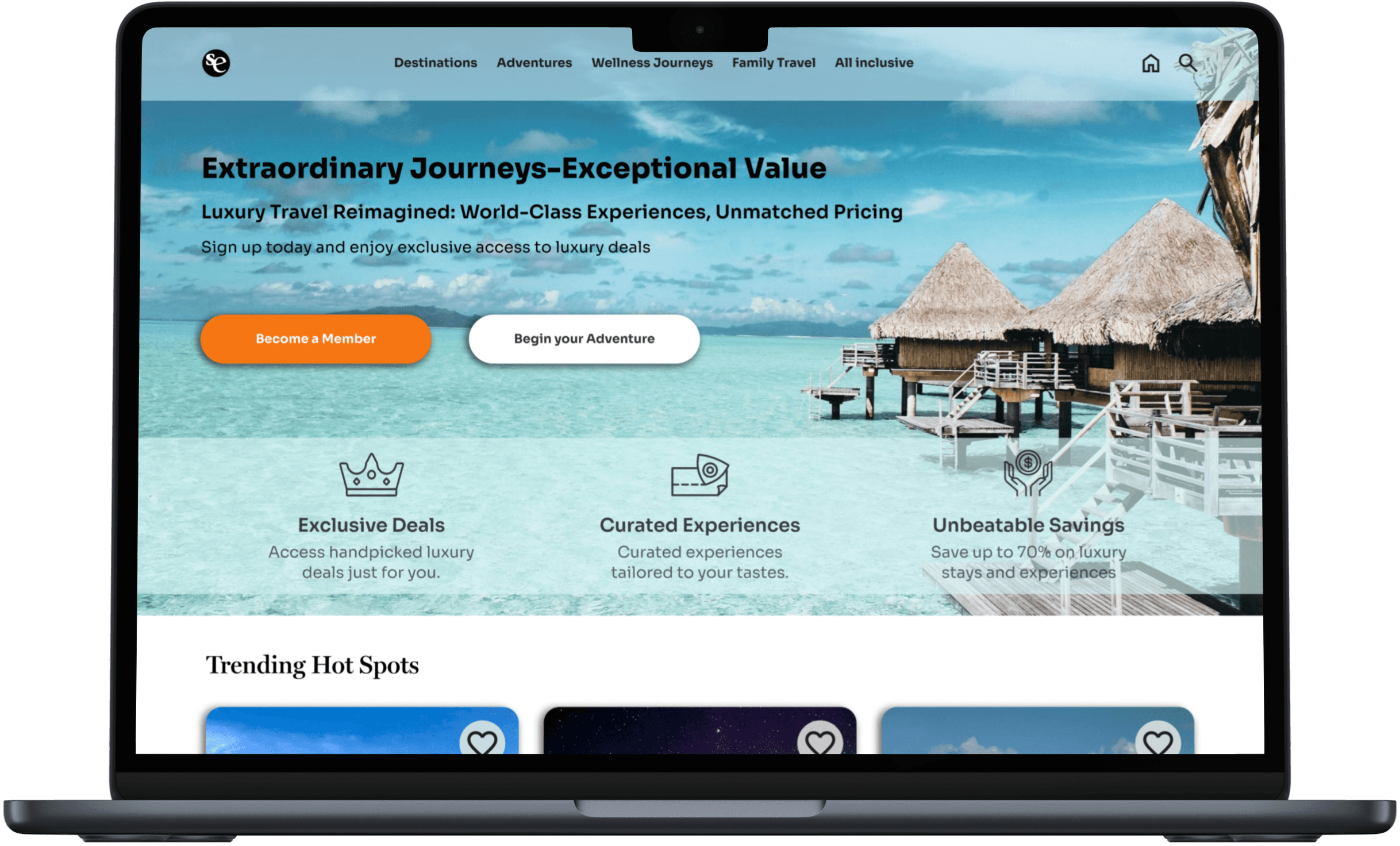
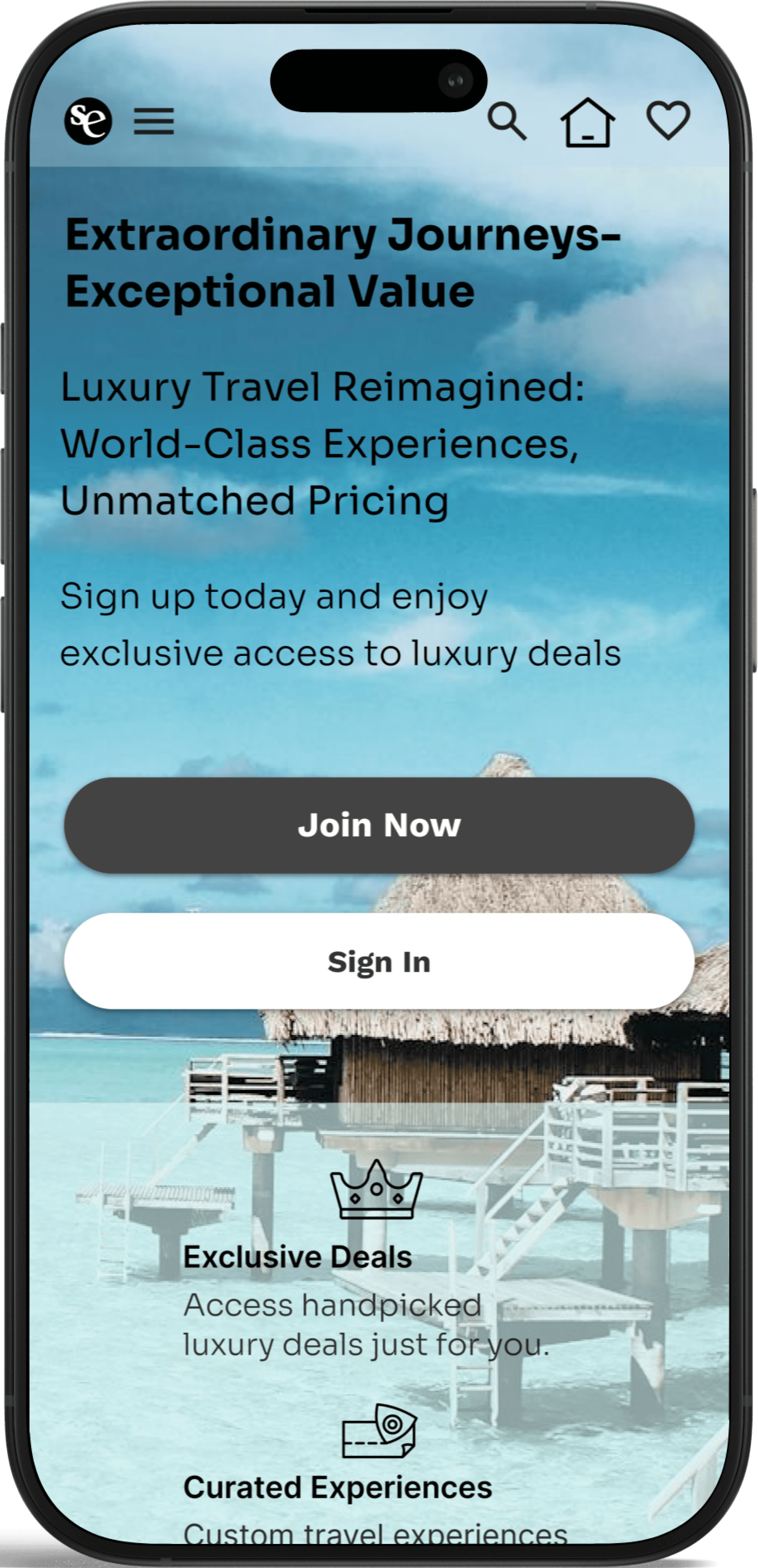
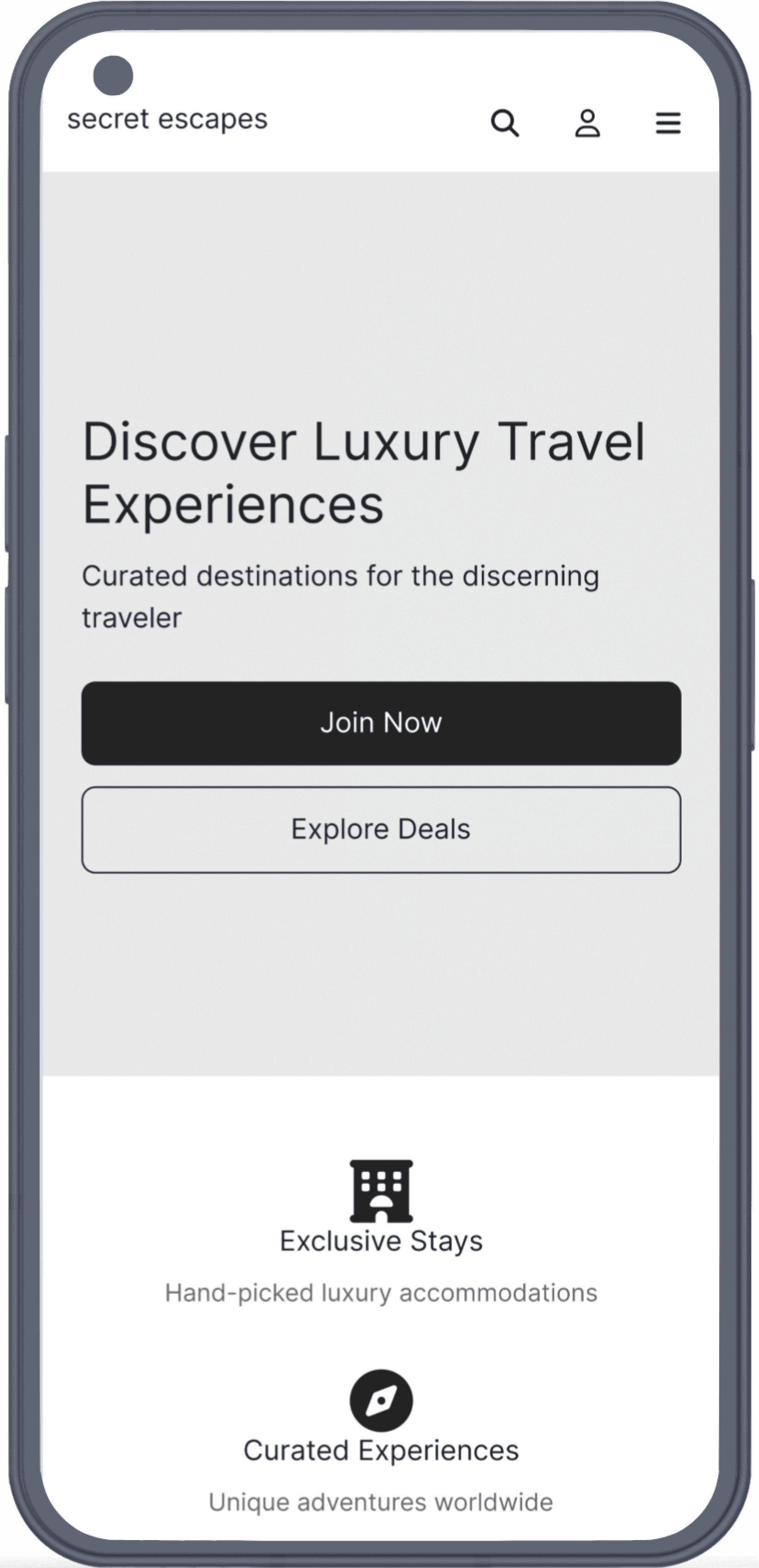
Luxury Travel Reimagined
Luxury Travel Reimagined
Responsive Design | UX Research & Design | 3 weeks
Responsive Design | UX Research & Design | 3 weeks

Overview
Overview
Key Objective
To address the high bounce rates (46.65% on desktop, 62.93% on mobile), the redesign focuses on improving mobile responsiveness, intuitive navigation, and a more personalized booking experience. By elevating usability and aligning the interface with user expectations, the goal is to drive higher engagement, retention, and conversion rates.
Problem
Secret Escapes promotes luxury travel, but its current website experience falls short—marked by a cluttered interface, overwhelming flash sale banners, and a disjointed user journey. With a bounce rate of 46.65%, it's clear there are engagement and usability concerns. A redesign is needed to align the site’s visual identity with its premium brand, streamline navigation, and deliver a seamless, intuitive booking experience that reflects the quality of its offerings.
Key Objective
To address the high bounce rates (46.65% on desktop, 62.93% on mobile), the redesign focuses on improving mobile responsiveness, intuitive navigation, and a more personalized booking experience. By elevating usability and aligning the interface with user expectations, the goal is to drive higher engagement, retention, and conversion rates.
Process
Process
Research
Define
Design
Test
Iterate
Research
Research Goals
Understand user behavior and expectations when interacting with travel booking websites to uncover usability gaps and frustration points.
Identify key areas of friction—such as navigation, content clarity, and perceived brand quality—that may impact engagement and booking decisions.
Gather insights to prioritize design improvements that align with user needs while supporting business goals like reducing bounce rates and increasing conversions.

Affinity Mapping
Interview Insights
I always look at the photos first—if I can't see what the destination or hotel really looks like, I won’t even consider booking it.
– Participant from Wisconsin
Finding family-friendly options should be simple. I don’t want to sift through tons of listings—I just need a clear way to see the best choices for traveling with kids.
– Participant from Florida
Research
Research Goals
Understand user behavior and expectations when interacting with travel booking websites to uncover usability gaps and frustration points.
Identify key areas of friction—such as navigation, content clarity, and perceived brand quality—that may impact engagement and booking decisions.
Gather insights to prioritize design improvements that align with user needs while supporting business goals like reducing bounce rates and increasing conversions.
Affinity Mapping
Interview Insights
I always look at the photos first—if I can't see what the destination or hotel really looks like, I won’t even consider booking it.
– Participant from Wisconsin
Finding family-friendly options should be simple. I don’t want to sift through tons of listings—I just need a clear way to see the best choices for traveling with kids.
– Participant from Florida
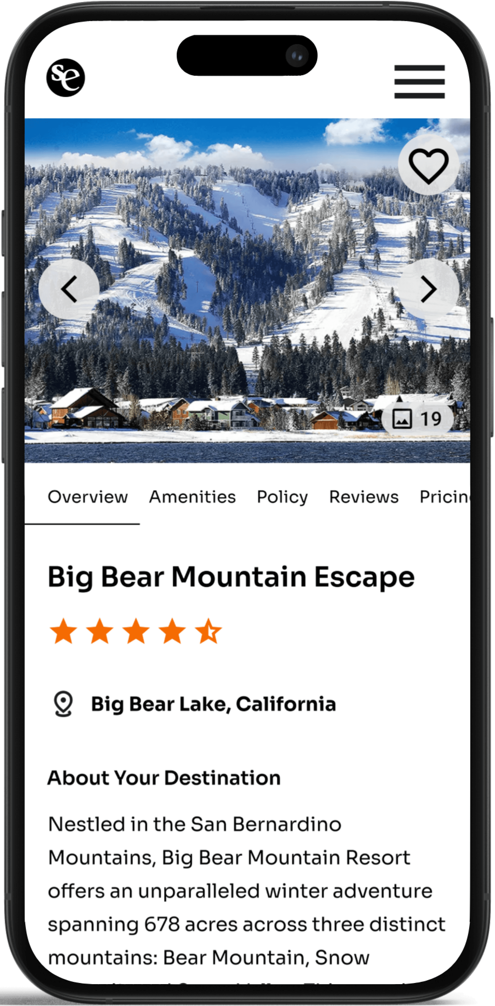
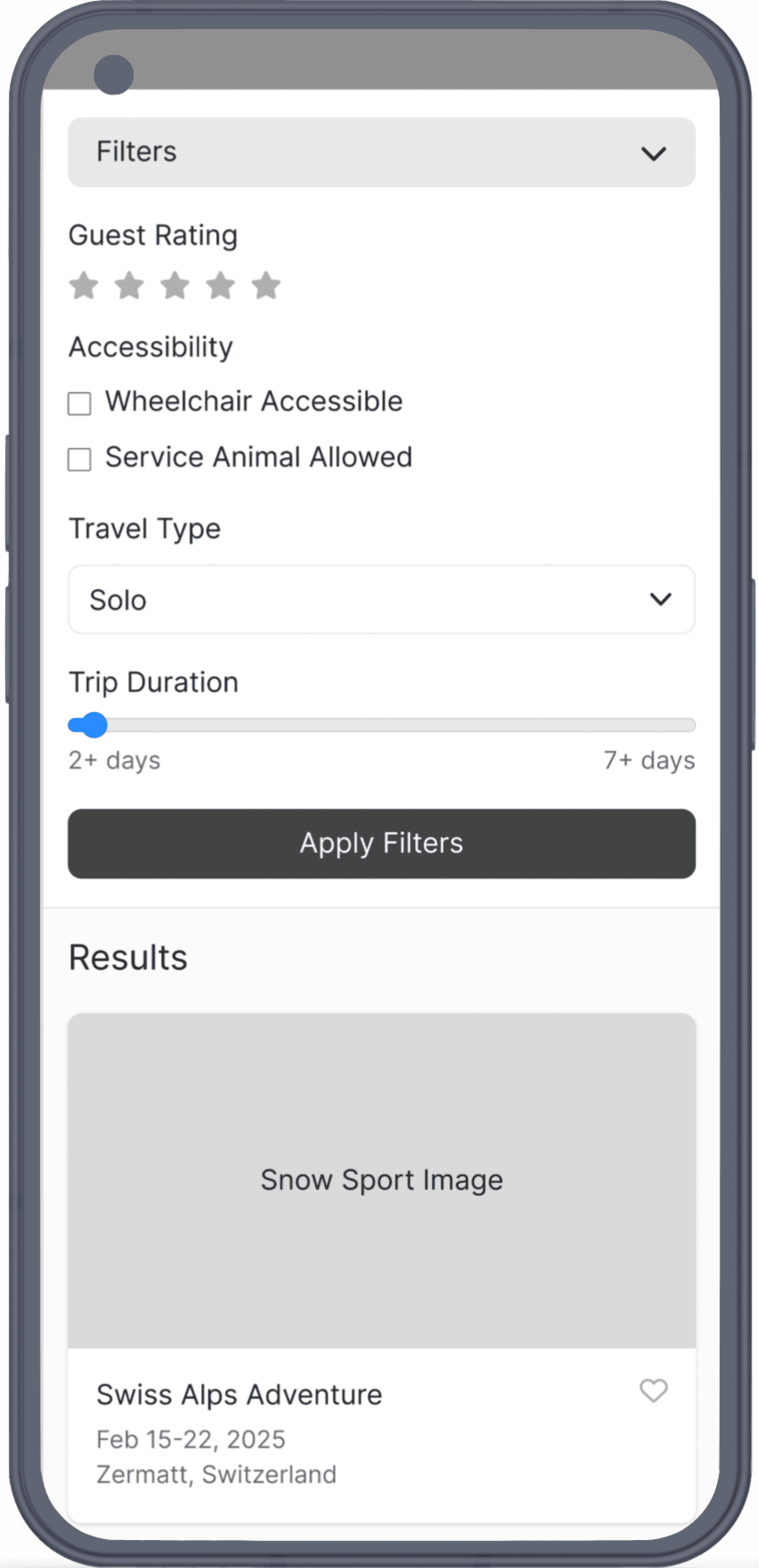
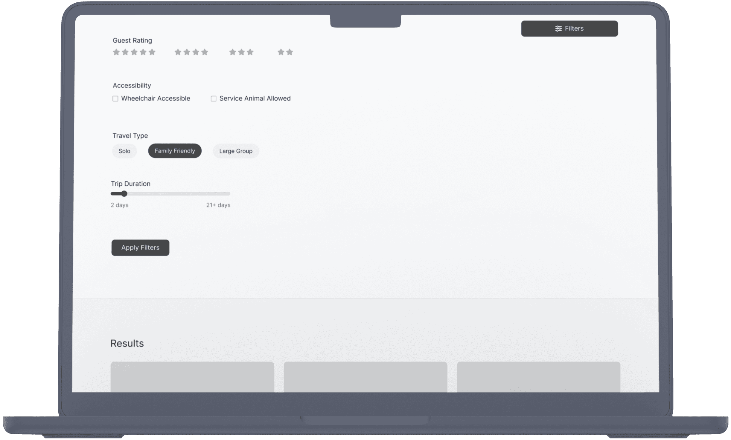
Key Findings
Users depend on filters and search tools—like price, ratings, location, and categories such as “family-friendly” or “unique stays”—to quickly narrow down relevant options.
Overly cluttered pages and dense text create frustration, especially when users are trying to find specific types of accommodations.
Detailed customer reviews strongly influence decision-making, particularly for families seeking reassurance and real-life context before booking.
Information Architecture

Process
Research
Define
Design
Test
Iterate
Feature Set
Information Architecture
Define
Research
Research Goals
Understand user behavior and expectations when interacting with travel booking websites to uncover usability gaps and frustration points.
Identify key areas of friction—such as navigation, content clarity, and perceived brand quality—that may impact engagement and booking decisions.
Gather insights to prioritize design improvements that align with user needs while supporting business goals like reducing bounce rates and increasing conversions.
Affinity Mapping
Interview Insights
I always look at the photos first—if I can't see what the destination or hotel really looks like, I won’t even consider booking it.
– Participant from Wisconsin
Finding family-friendly options should be simple. I don’t want to sift through tons of listings—I just need a clear way to see the best choices for traveling with kids.
– Participant from Florida
Key Findings
Users depend on filters and search tools—like price, ratings, location, and categories such as “family-friendly” or “unique stays”—to quickly narrow down relevant options.
Overly cluttered pages and dense text create frustration, especially when users are trying to find specific types of accommodations.
Detailed customer reviews strongly influence decision-making, particularly for families seeking reassurance and real-life context before booking.
Bridging Business Goals with User Needs
I aligned the company’s goal of increasing user engagement with the need for personalized, intuitive trip discovery. Through “How Might We” statements, I explored ways to reduce friction in the search experience while maintaining brand trust. User feedback revealed confusion around filtering and exploration—leading to features that made trip planning feel more spontaneous, visual, and rewarding.
How Might We
...improve the travel booking experience by eliminating hidden fees, reducing ad clutter, and offering flexible package customization that prioritizes ease and transparency?
...make it easier for families to find and plan travel by providing intuitive filters, clearer information on amenities, and personalized kid-friendly itineraries?
...enhance adventure travel booking by offering more precise filters, better trip planning resources, and tools for community engagement to support shared experiences?
Information Architecture
Define
Key Findings
Users depend on filters and search tools—like price, ratings, location, and categories such as “family-friendly” or “unique stays”—to quickly narrow down relevant options.
Overly cluttered pages and dense text create frustration, especially when users are trying to find specific types of accommodations.
Detailed customer reviews strongly influence decision-making, particularly for families seeking reassurance and real-life context before booking.
High Fidelity Designs


Define
High Fidelity Designs
Feature Set
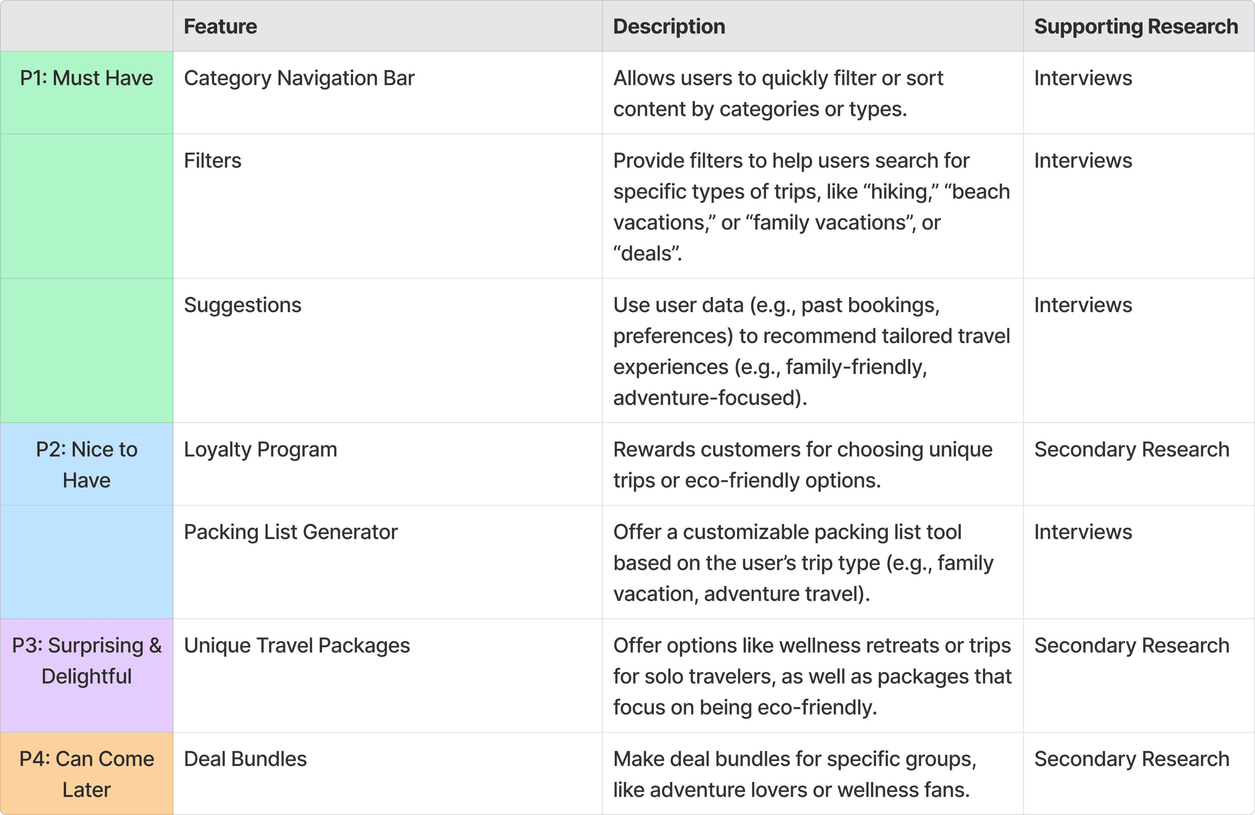
Feature Set
User Flow | Sign In - Log In - Filter Feature

Bridging Business Goals with User Needs
I aligned the company’s goal of increasing user engagement with the need for personalized, intuitive trip discovery. Through “How Might We” statements, I explored ways to reduce friction in the search experience while maintaining brand trust. User feedback revealed confusion around filtering and exploration—leading to features that made trip planning feel more spontaneous, visual, and rewarding.
How Might We
...improve the travel booking experience by eliminating hidden fees, reducing ad clutter, and offering flexible package customization that prioritizes ease and transparency?
...make it easier for families to find and plan travel by providing intuitive filters, clearer information on amenities, and personalized kid-friendly itineraries?
...enhance adventure travel booking by offering more precise filters, better trip planning resources, and tools for community engagement to support shared experiences?
User Flow | Sign In - Log In - Filter Feature
Bridging Business Goals with User Needs
I aligned the company’s goal of increasing user engagement with the need for personalized, intuitive trip discovery. Through “How Might We” statements, I explored ways to reduce friction in the search experience while maintaining brand trust. User feedback revealed confusion around filtering and exploration—leading to features that made trip planning feel more spontaneous, visual, and rewarding.
How Might We
...improve the travel booking experience by eliminating hidden fees, reducing ad clutter, and offering flexible package customization that prioritizes ease and transparency?
...make it easier for families to find and plan travel by providing intuitive filters, clearer information on amenities, and personalized kid-friendly itineraries?
...enhance adventure travel booking by offering more precise filters, better trip planning resources, and tools for community engagement to support shared experiences?
User Flow
Sign In | Log In | Filter Feature
Design
Wireframing
Wireframing
Wireframing


High Fidelity Designs
The pictures and tabs are great. It’s easy to scan the amenities and pricing.
– Participant from Ohio
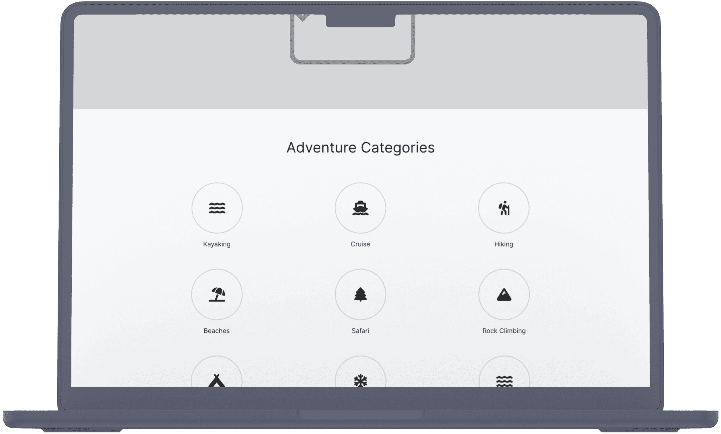
I’m not sure I get a luxury vibe from the icons in the Adventure section, maybe add some visuals to be more engaging?
– Participant from Nebraska
Test
Usability Feedback
Usability Feedback
The pictures and tabs are great. It’s easy to scan the amenities and pricing.
– Participant from Ohio
I’m not sure I get a luxury vibe from the icons in the Adventure section, maybe add some visuals to be more engaging?
– Participant from Nebraska
The pictures and tabs are great. It’s easy to scan the amenities and pricing.
– Participant from Ohio
I’m not sure I get a luxury vibe from the icons in the Adventure section, maybe add some visuals to be more engaging?
– Participant from Nebraska
Before
After

1
2
3
1
2
3
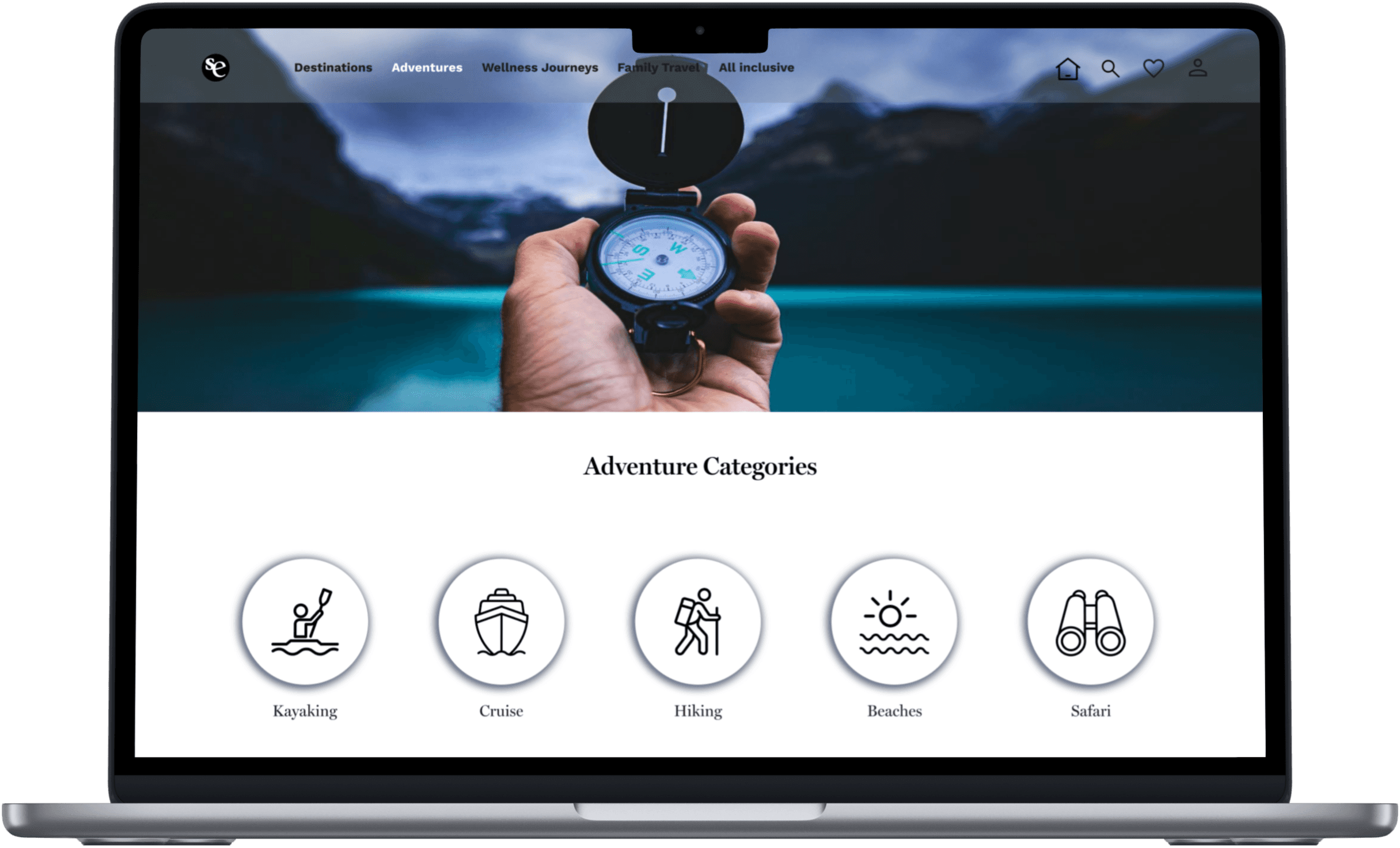
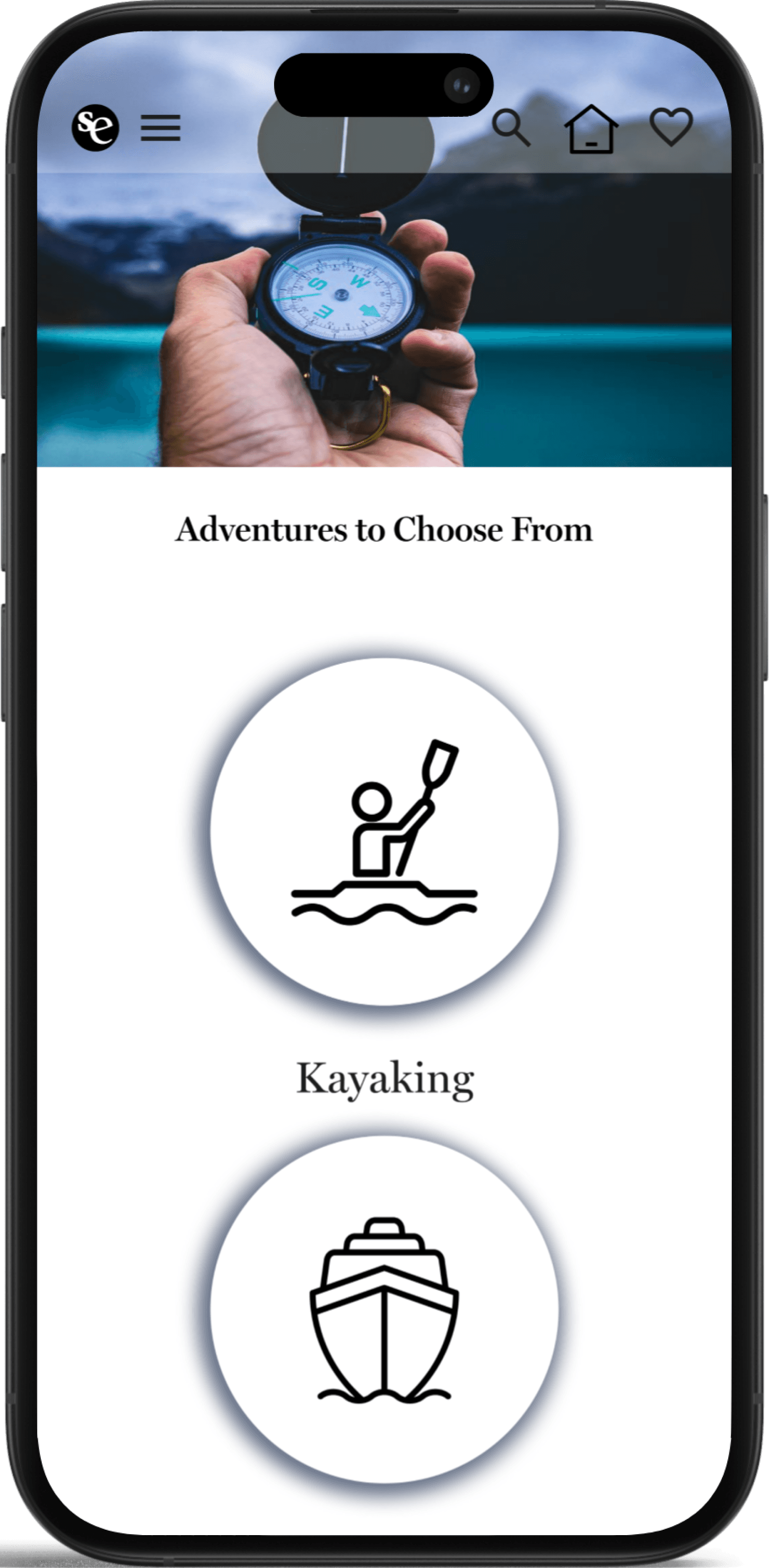
Redesigned the Adventure section card to create a more engaging and visually appealing experience.
Refined shadow styling for a cleaner, more polished look.
Improved text hierarchy between the header and body copy to enhance readability and user focus.
Iterate


1
2
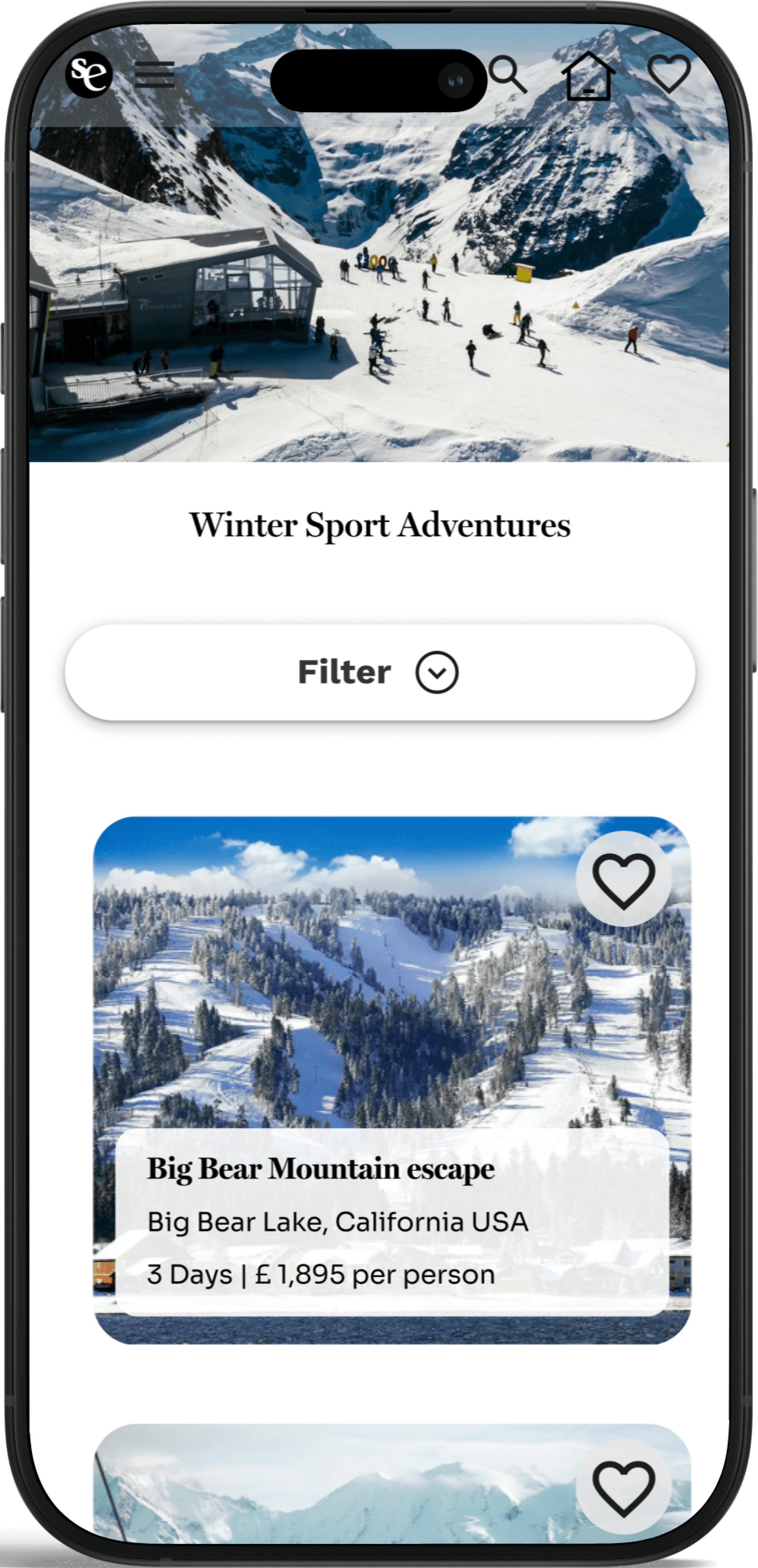
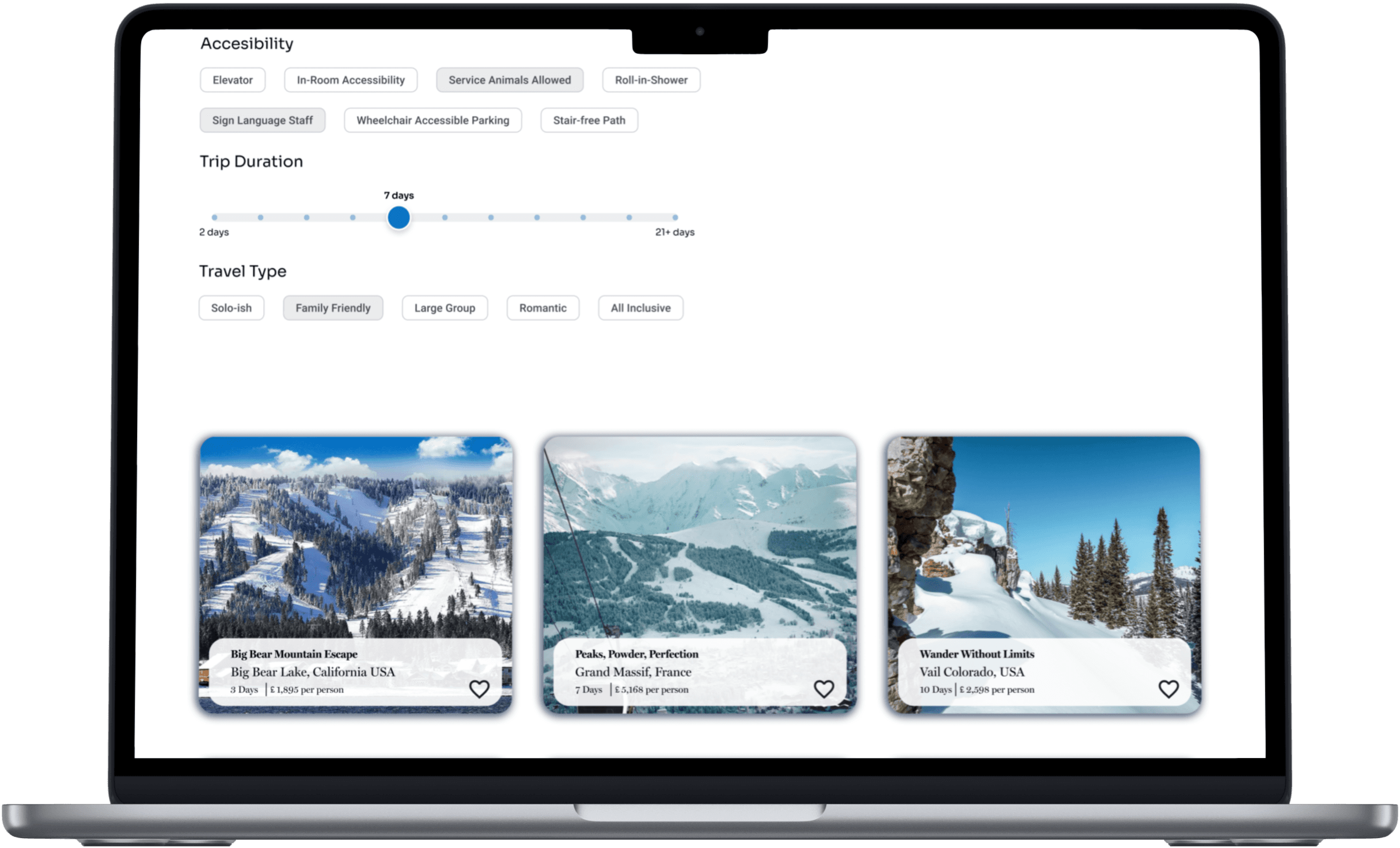
Enlarged the destination card to improve spacing, visual balance, and overall readability.
Applied a subtle drop shadow to clearly signal interactivity and enhance user engagement.
Before
After
Based on usability feedback, I made several refinements to improve clarity, engagement, and overall user experience. These changes focused on addressing visual hierarchy, navigation patterns, and interactive cues; ensuring users could more easily understand and interact with the interface. Below are key design adjustments made across both mobile and desktop views.
Based on usability feedback, I made several refinements to improve clarity, engagement, and overall user experience. These changes focused on addressing visual hierarchy, navigation patterns, and interactive cues; ensuring users could more easily understand and interact with the interface. Below are key design adjustments made across both mobile and desktop views.
1
2
3
Redesigned the Adventure section card to create a more engaging and visually appealing experience.
Refined shadow styling for a cleaner, more polished look.
Improved text hierarchy between the header and body copy to enhance readability and user focus.
Before
After
1
2
3
Redesigned the Adventure section card to create a more engaging and visually appealing experience.
Refined shadow styling for a cleaner, more polished look.
Improved text hierarchy between the header and body copy to enhance readability and user focus.
1
2
Enlarged the destination card to improve spacing, visual balance, and overall readability.
Applied a subtle drop shadow to clearly signal interactivity and enhance user engagement.
Before
After
1
2
1
2
Enlarged the destination card to improve spacing, visual balance, and overall readability.
Applied a subtle drop shadow to clearly signal interactivity and enhance user engagement.
Solution
The responsive redesign delivers a seamless, user-friendly experience through intuitive navigation and a refined visual hierarchy. Luxury travel deals are now showcased with elegance, replacing cluttered flash sale banners with a polished, brand-aligned presentation—boosting both usability and engagement.